False Machine (7)
By:
July 6, 2015
The following post originally appeared at Patrick Stuart’s blog False Machine. It is one in a series of 10 analyzing the mini (miniature figure, used in wargames) and other small-scale fantasy and sci-fi models as an art form.
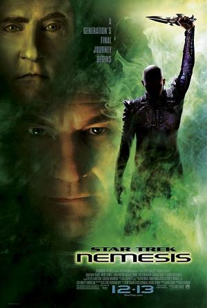
Opening My Doom-Wings Takes A While
A guy named Thomas Hunt has taken all of the original Star Trek films and cut them down to just those parts that feature ships. So each film is a 5- to 30-minute version featuring just those images of ships or other objects in space. Storytelling with little more than complex objects moving through space.
This post is a consideration of the spaceship scenes in these movies: Star Trek V: The Final Frontier (1989), Star Trek VI: The Undiscovered Country (1991), Star Trek Generations (1994), Star Trek: First Contact (1996), Star Trek: Insurrection (1998), and Star Trek: Nemesis (2002). In the previous post in this series, I considered other Star Trek movies.
Shatner is directing and the budget has been cut. This spaceships-only excerpt is only five minutes long. During those five minutes, though, the film manages to pack and lot of dumb in.
The blue space house makes a return — with a Scotty voiceover introducing the new Enterprise. The little diddy shuttles make a return and they are awful, buzzing around like shitty little bees.
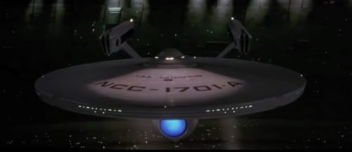
None of the methods used by previous directors to trick us into believing in the size and mass of the Enterprise are in use now. The lighting is bland, the ship is rarely seen from any interesting or unusual angles, the camera is not interested in her either as an object or as a character. The intro shots have all the dull familiarity of a sitcom scene opening with an exterior of an office building for a bit set in an office. Clearly the script said ‘EXT. THE ENTERPRISE HANGS IN SPACE’ and that’s all it fucking said because that’s all they fucking shot.
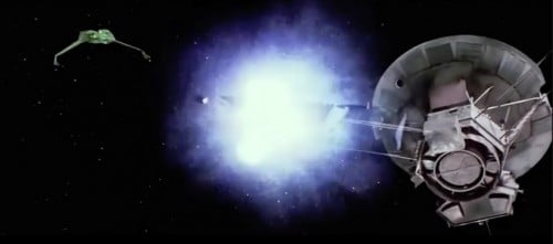
Last time the Klingons turned up, they had a bad-guy scene where they blew up a ship made from the gribblies from the model-makers’ buckets. This time they seem to blow up the Voyager space probe. Considering the fact that the film had budget problems, it’s embarrassing that Shatner spent money on a cheap shot (literally) against the first Star Trek film.
The Voyager space probe makes a little Star Wars style ‘sad robot’ sound as it get blown up, which sets the emotional tone quite nicely — or accurately, anyway.
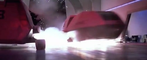
There it another embarrassing scene where a diddly shuttle about to be blown up escapes by suddenly moving superquick, something we have not seen shuttles do so far. It crashes into the landing bay set, which looks as if the people building it didn’t quite get it finished before the filming started.
There is more of the landing bay.
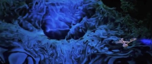
The Enterprise feels more like a special effect than she ever has before. There is one scene with a blue space curtain where she simply moves wrong, like an Enterprise cursor being moved against a screen. The seduction of mass has been abandoned for this film.
Eventually we reach a kind of lava-lamp planet which looks momentarily beautiful. It’s the only good thing in the film.
Klingons shoot God.
End.
“After three years I’ve concluded my first assignment as master of this vessel, cataloguing gaseous planetary anomalies in beta quadrant.” Sulu made captain, and they gave him a shit detail for three years?
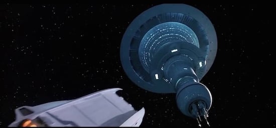
There is a little more dynamism with the camera here. We approach Space House from below with a shuttle, which is nice.
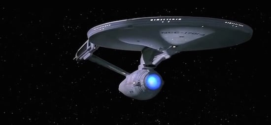
The lighting and Enterprise shots are slightly better than last time, which isn’t saying much.
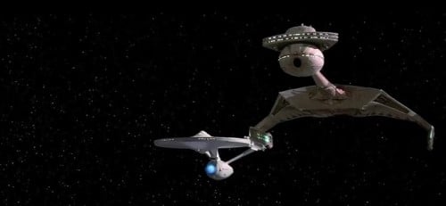
An old-school bird of prey shows up, we haven’t seen those since TMP.
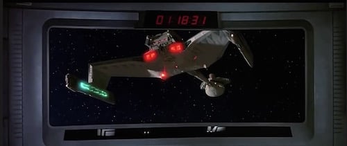
Ahhhh, here we have the in-ship view-screen shot… shot I think I will come to hate. The camera doesn’t place us in the ship’s bridge, then turn to the viewscreen as if it were part of the natural scenery… instead it locks us in a static shot facing the viewscreen, a screen which itself shows only one view, that going directly forward.
This is a terrible shot, it’s like having a scene in a film where you watch someone’s television in their house, the camera sits in front of the television and doesn’t turn. But the television is only showing things directly behind the television. It’s like a reality inside a reality and possibly there are cool ways to do that but this film doesn’t use them.
Because camerawork and direction essentially creates space and time within the film, and because space combat is essentially about space and time, the worse the direction is the more stupid the choices made in space combat are.
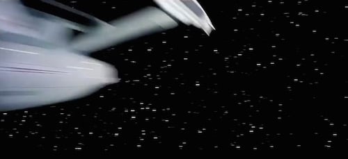
Parts of this are not that awful: Space is shadowed again, the Enterprise swoops past the camera so fast the camera has to turn quickly to keep up and loses sight for a second.
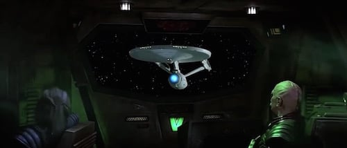
We have the p.o.v of a Klingon viewscreen for the first time, and from inside Sulu’s ship. Now we can actually see crew members and captains looking at the same screen we are looking at.
A slight resurgence before the end for the TOS crew.
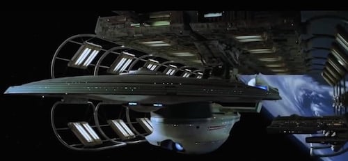
A very short ‘glory’ shot of the new Enterprise. The spot lamps, shadows and skating-past of gantries have returned.
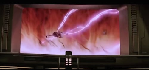
Computers can’t simulate weird things in space as well as some ink in a tank, at least not by the time this film was made. The loopy ’70s lava lamp space-things from TMP and FF both seemed more real than this CGI space thread.
And we are back with the view screen shots.
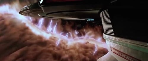
The camera is actually moving boldly here, it clings to the hull, allows the ship to drift partly out of shot to indicate size and loss of control. Shadows have been attempted. Yet this still feels like TV. Why does it feel like TV? Is it the strange glimmering of CGI? Yet I am pretty sure that a model is being used.
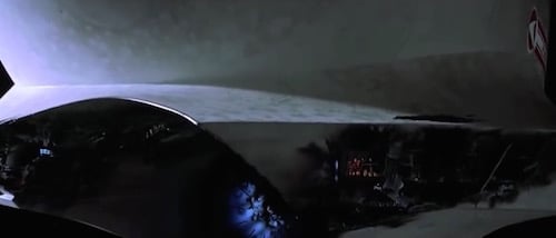
Slow camera pans treating the ship’s mass as a landscape and showing azteking and ship damage — allowing us to actually see inside the structure with little people there to show scale. These are all good ideas yet, for some reason, I’m not feeling it.
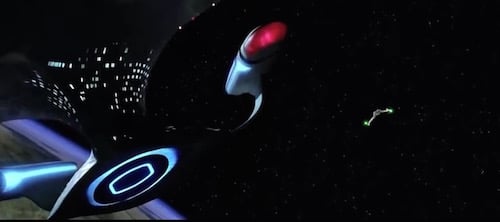
I wish I could explain this more clearly. Perhaps it is the ease with which ships are thrown around the screen, the lightness with which they move. Perhaps some barely perceptible shift in detail in the move from models to CGI, or the combination of CGI with models. If you just write down what happens in this film, and the techniques and shots used, I would be impressed. But nothing feels dramatic. The mass is gone.
The shift in the feel of the Star Trek films seems to be as much a symptom of the kind of visual zeitgeist in which they were made as it is the product of any particular piece of technology.
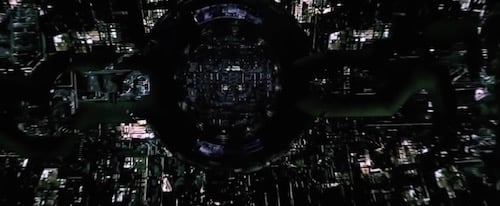
Picard locked in an infinitely regressing Borg nightmare shown in one shot is something you can only really do with CGI, and is conceptually the exact opposite of the V’ger scenes from TMP. In the V’ger scenes, you are endlessly going into something alien and its dangerous but beautiful. In Star Trek: First Contact you are already trapped there and it’s endless and consuming. And this is an opening shot, I think!
So that’s good, it shows that director Jonathan Frakes is wrestling with the technology — making it do things instead of being led by it. This is really a surprisingly good film for Frakes. I keep thinking, ‘Jonathan Frakes directed this?’
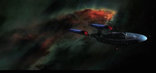
There is dust in space now and someone has jammed some shots from Hubble in the background so it’s not just stars. The representation of outer space in Star Trek changes with our understanding of space — and that advances year by year. One day people will see the history of our science in the background to these sci-fi dramas.
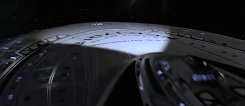
The opening shot for the new Enterprise isn’t set in space dock but other than that, it uses all the classic lighting tricks. There are spotlights from the ship itself, an outside light source — not vague and polarised, but casting a specific gleam on one section of the ship, pushing the rest into shadow. In the darkness of the shadows, the ship’s window lights highlight the shape. This means the same mass is created in the eye in two different ways for the same object depending on how dark it is, either as a solid thing, lit from without, or as a ‘filled’ or ‘full’ but perforated object with light inside that leaks through. The combination of the two sensations, at once, as an organic whole is very powerful.
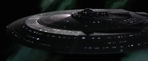
The ship is moving and turning and the shadow is moving across it. The Enterprise is darker here than I have ever seen it before, almost charcoal grey.
This still feels a bit like TV… but it feels like really good TV.
Whatever they are doing to create a sense of structure in the surface of the ship — it doesn’t quite work, it looks like a render over a 3d frame. Like a very fancy sheet stretched tight over a tent. The azteking or greebling which was so subtly judged before now feels slightly ‘off’, the tiny interruptions of form don’t play over the eye in quite the same way.
The Borg cube might look cool as fuck but it doesn’t have James Horner trumpets to remind you that it’s cool like the Klingons did, and a conventional orchestral signature really doesn’t suit the Borg. They should have banged in some Aphex Twin.
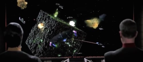
In the big fight we have more Starfleet ships on screen together than ever before, clustering around the Borg cube like flies. White on black. The view screen shots almost work well here, the battles are ‘loud’ and the in-screen shots are ‘quiet’ which makes them feel sombre and serious.
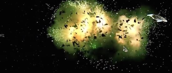
Seems no one anywhere can make things blow up in space in any way other than the first Death Star in Star Wars. Strap it to the ceiling with some black velvet, put the camera underneath pointing up and film it that way, been a classic technique for 20 years by this point.
There are some real bursts of creativity here with the Enterprise seen very far off as if witnessed from the ground, then an elegant camera swoop that turns the ship upside down and shows the little spaceman figures of the crew walking on it like a white desert (we are back to the little men from the first few films), then cuts to their point of view in which the hull is literally a landscape to be traversed and walked over. Seriously, well done to whoever came up with this part.
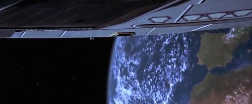
The Enterprise starts looking super-cheap almost right away… but it’s still a bravura concept that knits together a lot of scale-creation techniques from previous films in an original new way.
Then Picard has to blind his own ship because symbolism.
The white swarm motif is repeated by a bunch of escaping life pods.
The rest is a curious mix of filmic and televisual styles. I imagine the supreme effort of will it took to make the ST production team produce anything that doesn’t look totally like TV was abating at that point.
Television is about getting something very complex done as quickly as possible, with serious time constraints, and using effects and objects that can be re-used in a useful way. Both as in the models and lighting effects, but also the story telling techniques. In a serial show a nice conservative shot that tells a TV audience ‘The Enterprise is here’ or ‘The Enterprise is Doing This Now’ is financially viable and also lessens the cognitive load required to understand and lets the show do other things with the same brain space: you can see where the Enterprise is and have Picard tell you about some difficult negotiations at the same time and easily get both ideas at once because the shot is like a familiar meal.
In film you are trying to take the same structure of effects and almost make it do the opposite thing. You don’t need to worry about the audience’s attention so much. They paid money already and are sitting in front of a huge screen. You have to take the technology and culture of thought and action you used to make the impossible familiar for a TV audience and use it to make the familiar (another alien world, the Enterprise in a dust cloud) strange and beautiful. You want the shot to require cognitive energy. What was a part in a machine must now become a work of art.
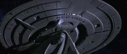
Frakes is back as director, but… ohhhhhh, the first Enterprise shot is PLASTICKY. My God, computers hate shadow and depth.
The additional Hubble space backgrounds mean that our imagined outer space has its own geography and depth. It is no longer a simple void.
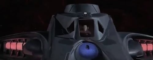
We have Nimoy’s clouds back a little. Data has a little-man-in-ship shot that doesn’t quite work, or at least doesn’t really seem to do much.
Shuttles usually buzz about near the Enterprise to highlight the fact that the big ship is *not* buzzing about. But now the little diddly ships almost have their own show. They are as annoying as they were before but the CGI gleam has made them even more weightless, and there is a lot of them. They also don’t interact with the clouds they are in, or with anything, until they hit the ground.
Top Gun is all about making you feel the mass and gravity of men in small things going super fast. Star Trek is not. The Star Trek shuttles are big enough for Picard to have a bonding moment with Wesley in. They are stage sets first, not vectors of dramatic motion — they do not feel good moving fast. The most important thing in a Star Trek shuttle is usually not how fast it is going but the conversation people are having inside.
The organic surface of this world as seen from space is more beautiful than any world seen thus far, and actually feels like a planet rather than the representation of a planet.
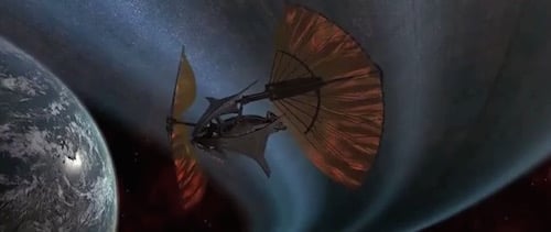
Oh God, there is a super-long ship-unfolding sequence.
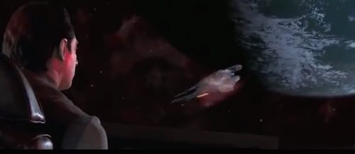
Because Data is almost always calm, the shots from inside his little shuttle, from behind his head look exactly as if he is playing a computer game on a plasma tv.
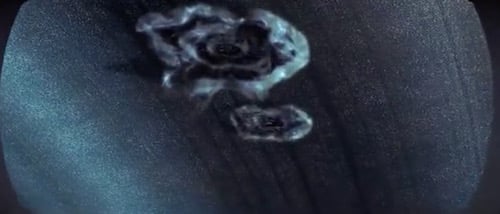
There is a tiny flash of the old Trek hippie weirdness as a planetary ring is transformed to cloud. Nimoy and Rodenberry would both have liked that.
The Enterprise is bigger and meaner and sleeker than ever in this film and never feels like anything other than a toy being waved about by a child. Sometimes a likeable and energetic child, but nonetheless.
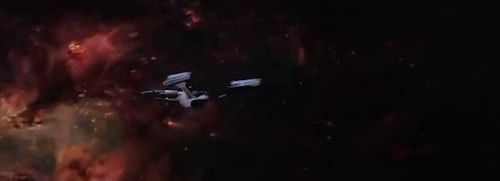
And the Enterprise is now so grey that it is dark against space. They need to highlight it against a bright nebulae, in order to trace its departure; before, it was always white against the dark. Sigh. Dad bought a leather jacket.
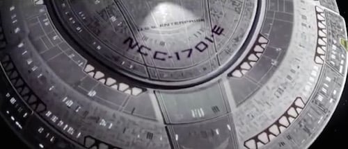
Aaand… the azteking is back in the opening shot. It still doesn’t look quite right.
Ah, crap! There is more shuttlecraft dicking around on-planet. There is at least a half-interesting POV shot. But then an awful stunt.
Shuttles crashing, shuttles being too fast, shuttles having little shuttle adventures — all these are bad signs.
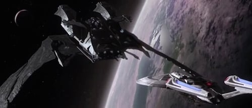
The bad-guy ship has the same general format as the classic Bird of Prey, but not as elegantly made. They have just made it bigger, blacker, and more angular. The Enterprise is huge now, so to be correctly scary the bad guy ship has to be super-super big.
It does appear quite neatly with its wing bisecting a planet’s curve. The death ship has a head-on profile like a friendly woodlouse and some nice ocean-view windows running down its side.
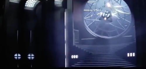
Oh god there is a diddly little ship-INSIDE-ship escape scene. It’s more like a computer game than anything has been so far. Why did you put a handy cathedral escape window on your super-black death ship?
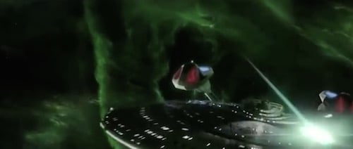
A load of vaguely lit, super-light mega ships wail on each other for ages in green space with zap guns. The super-weapons of the future feel like they do nothing at all. They boy with his toys has invited friends to play. It’s like watching giant wrestlers fight by flicking rubber bands at each other whilst racing around on roller blades.
Hey a guy gets sucked out into space! That’s a first!
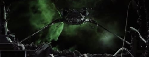
The viewscreen shot has now been replaced by a shot through the hull of the ship with a force field providing structure. The tear in the ship’s hull is exactly the same shape as a viewscreen, and the behaviour of the other ship is exactly the way it always is on these situations: perform an almost ritual swingaround and come to a stop directly in front of the Enterprise — facing it dead on, thereby turning the strange dissonance of seeing outside space through a tear in the ship’s hull into a completely familiar experience.
The Enterprise head-butts the death ship! But the death ship was meant to be basically a giant knife, and you are not meant to head-butt a knife. Still, for some reason, the soft round Enterprise has a more powerful superstructure than the black bladelike ship built for WHHAAAARRRRR. It’s like watching a hipster with an iphone punch out a squaddie with one blow: You can’t quite believe it happened.
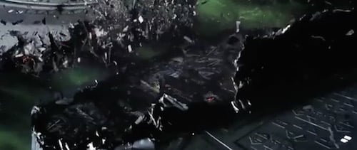
This does show massive in-ship damage in a way unlike any other Trek film has. The ship has giant internal spaces that are crushed and there are little alien dudes in the big spaces to give scale to the immensity of the action. It’s a brave stab but doesn’t quite work. It’s probably the most interesting shot in the film, though.
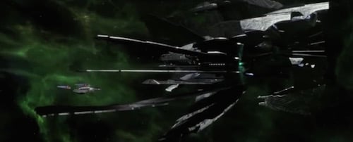
At 8.36 [in the ships-only film] the death ship starts opening its doom wings, from now until 9.46 when it explodes there are about (I think) 16 separate shots of it JUST OPENING ITS SUPER WEAPON. That’s not the time it takes in the actual film, that’s just the effects shots showing the endless unfolding. Roughly one minute and ten seconds.
From the blue beautiful self-indulgent ’70s mystical V’ger to the clenched, grey-black desperate-to-be-cool CGI of Shinzon’s hateship, it seems fitting that we end where we began: watching a physical thing unfold for fucking ages.
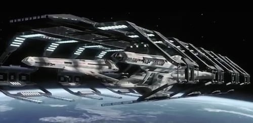
We finally end the film with a too-long series of shots of the grey Enterprise being greyly repaired in a slightly sad orbital space dock. It’s hard to kill a dream but they will greyly fade away with the coming of dawn and that’s exactly how Star Trek dies in screen, like a dream being forgotten as grey light fills the ceiling and street noise seeps in through the window.
The conclusion is a strange one. CGI didn’t kill the feel of Star Trek, lack of attention did. The first films spend a huge amount of creative and inventive energy seducing you into believing in the mass of the Enterprise. Mass is slowness, depth, sombreness, solidity and shadows. The series chipped slowly away at these things — sometimes for good reasons, sometimes for bad — but they could not fully renew what they removed. Perhaps because they didn’t realise they were missing it.
CURATED SERIES at HILOBROW: UNBORED CANON by Josh Glenn | CARPE PHALLUM by Patrick Cates | MS. K by Heather Kasunick | HERE BE MONSTERS by Mister Reusch | DOWNTOWNE by Bradley Peterson | #FX by Michael Lewy | PINNED PANELS by Zack Smith | TANK UP by Tony Leone | OUTBOUND TO MONTEVIDEO by Mimi Lipson | TAKING LIBERTIES by Douglas Wolk | STERANKOISMS by Douglas Wolk | MARVEL vs. MUSEUM by Douglas Wolk | NEVER BEGIN TO SING by Damon Krukowski | WTC WTF by Douglas Wolk | COOLING OFF THE COMMOTION by Chenjerai Kumanyika | THAT’S GREAT MARVEL by Douglas Wolk | LAWS OF THE UNIVERSE by Chris Spurgeon | IMAGINARY FRIENDS by Alexandra Molotkow | UNFLOWN by Jacob Covey | ADEQUATED by Franklin Bruno | QUALITY JOE by Joe Alterio | CHICKEN LIT by Lisa Jane Persky | PINAKOTHEK by Luc Sante | ALL MY STARS by Joanne McNeil | BIGFOOT ISLAND by Michael Lewy | NOT OF THIS EARTH by Michael Lewy | ANIMAL MAGNETISM by Colin Dickey | KEEPERS by Steph Burt | AMERICA OBSCURA by Andrew Hultkrans | HEATHCLIFF, FOR WHY? by Brandi Brown | DAILY DRUMPF by Rick Pinchera | BEDROOM AIRPORT by “Parson Edwards” | INTO THE VOID by Charlie Jane Anders | WE REABSORB & ENLIVEN by Matthew Battles | BRAINIAC by Joshua Glenn | COMICALLY VINTAGE by Comically Vintage | BLDGBLOG by Geoff Manaugh | WINDS OF MAGIC by James Parker | MUSEUM OF FEMORIBILIA by Lynn Peril | ROBOTS + MONSTERS by Joe Alterio | MONSTOBER by Rick Pinchera | POP WITH A SHOTGUN by Devin McKinney | FEEDBACK by Joshua Glenn | 4CP FTW by John Hilgart | ANNOTATED GIF by Kerry Callen | FANCHILD by Adam McGovern | BOOKFUTURISM by James Bridle | NOMADBROW by Erik Davis | SCREEN TIME by Jacob Mikanowski | FALSE MACHINE by Patrick Stuart | 12 DAYS OF SIGNIFICANCE | 12 MORE DAYS OF SIGNIFICANCE | 12 DAYS OF SIGNIFICANCE (AGAIN) | ANOTHER 12 DAYS OF SIGNIFICANCE | UNBORED MANIFESTO by Joshua Glenn and Elizabeth Foy Larsen | H IS FOR HOBO by Joshua Glenn | 4CP FRIDAY by guest curators
