Eye Candy (6)
By:
September 30, 2011
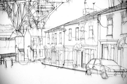
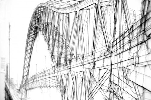
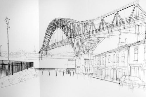
[Debbie Smyth, Jubilee Bridge, 5 x 2.5 meters, 3-panel wall installation, 2009]
Points and lines are among our most basic art supplies. Arguably they are simplified derivations of the irregular boundaries between light and shadow, or some arbitrary division thereof. Fast-forward several millenia and we see that, mathematically, it’s easier to describe a line segment than a smudge, and from there to spawn vector animations: explosions, superheroes, misfit toys, 3D versions of cave paintings…
However. In addition to precision calculations for special effects cinema, points and lines continue to have a robust presence in the analogue world.
Debbie Smyth deals with the built environment, although not in the way you might expect. Smyth creates her detailed, perspectival and mural-sized line drawings with pins and thread.
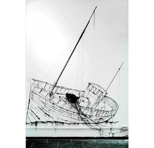
[Debbie Smyth, Ship to Shore, 3 x 4 meters, wall installation, 2009]
In the much-reduced online images, they are reminiscent of CAD outputs for city planning or landscape architecture. But zoom in — or, better — walk up to them, and their real 3D structure is revealed. The built environment is not only depicted in the representation, it is built into the drawing itself.
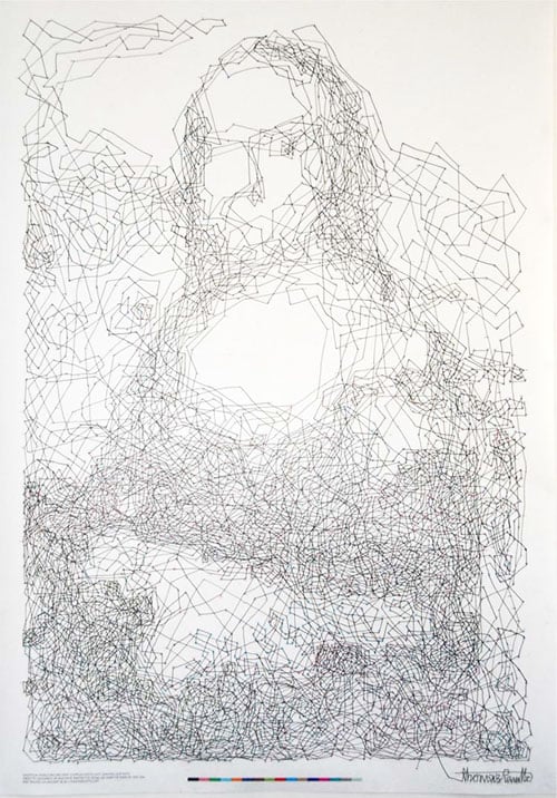
[Thomas Pavitte, mona, lisa, dot, 2011]
Thomas Pavitte’s linear exploration focuses on art history, that of the official western canon as well as the elementary school curriculum. Starting with the Mona Lisa (a strategy jump-started by Duchamp), Pavitte reverse-engineered the salient edges of the image to create a connect-the-dots diagram. Quite a bit larger than the original it outlines, there are 6,239 numbered dots — and drawing the lines between them took over 9 hours of work.
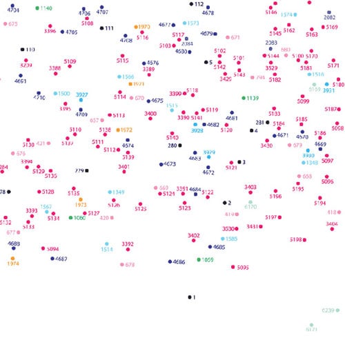
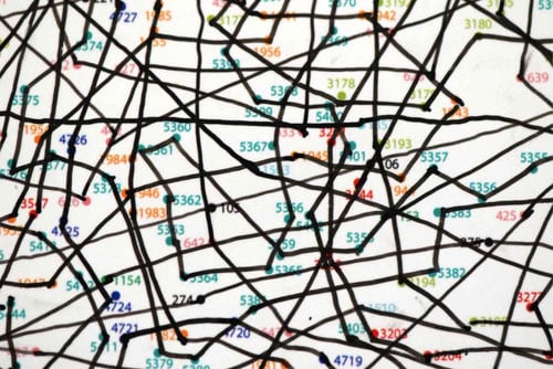
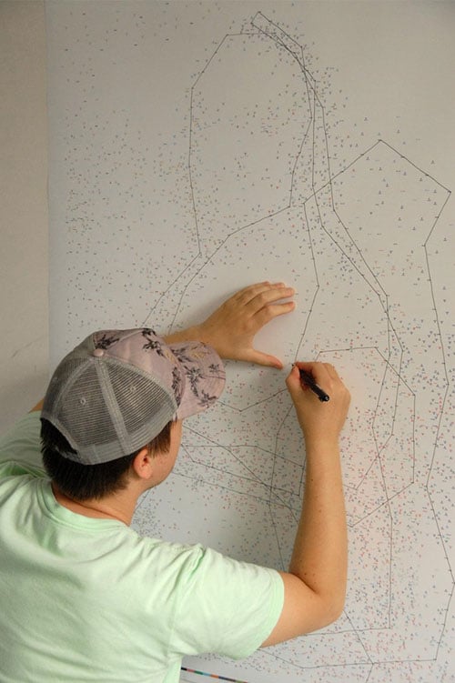
That’s a lot of extra credit.
Thanks to LRJP! and Rich Oglesby for linkage.
