4CP FTW (1)
By:
April 4, 2011
[First in a series of 10 posts from John Hilgart’s mesmerizing comic-book details site, 4CP (Four Color Process). We’re thrilled to share Hilgart’s hi-lo way of seeing with our readers.]

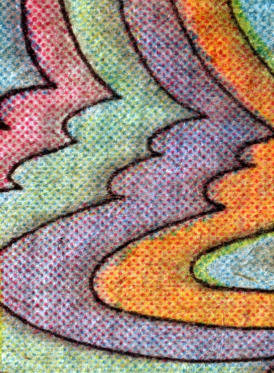
You’ve picked a great image to start your series. This is one of my favorites from the early weeks, when I was focused on abstraction. At that point, I didn’t want the original content or context of the source panel to be apparent.
What I love about this image is its indecision, the way it seems to shift back and forth between a row of bulbous snowman bunnies and a row of sharp-featured faces in profile. It’s almost an optical illusion. It reminds me of Peter Max. Sometimes the printing plates punched the paper, and sometimes they seemed to kiss it. This one was a kiss. The effect is so soft, and you can almost see the motion of the paper through the press.
It’s from a Jim Starlin frame in Captain Marvel #31 (1974). I’ve scanned the whole panel, so you can see the detail in context, but I used a recent Marvel Masterworks volume. Obviously, there would be no visual interest in the same crop taken from the reprint.
I’d forgotten about the copy at the top of this panel, but in retrospect, it could be my 4CP mantra.

