BUNNY CITY (INTRO)
By:
October 20, 2020
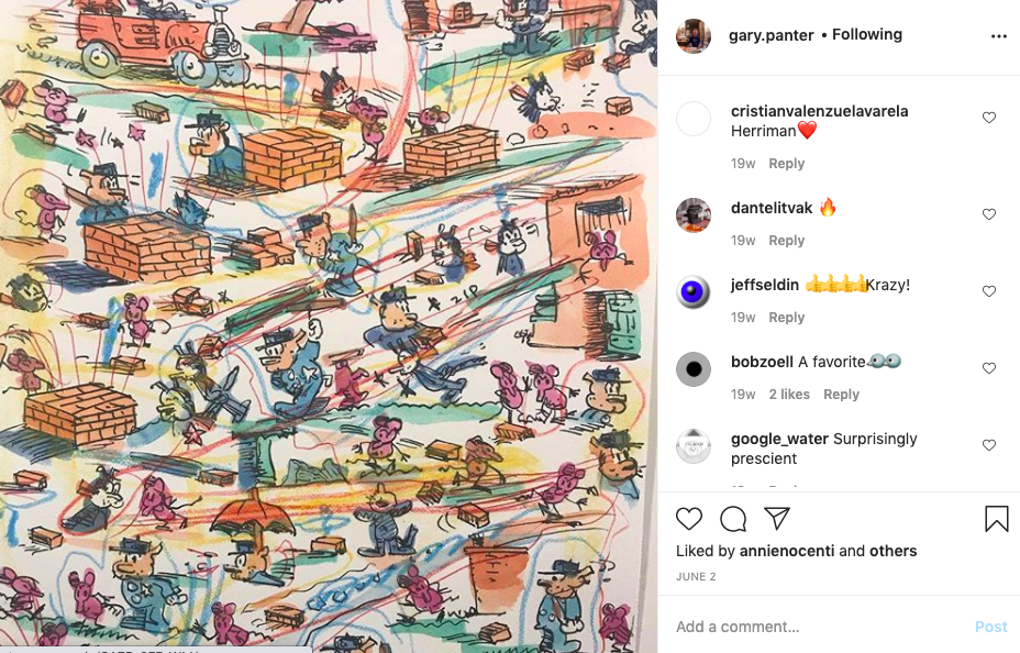
Over the next two or three weeks, we’ll post a selection of HILOBROW friend Gary Panter’s (untitled) recent series of drawings — cartoon characters, dinosaurs, cowboys and Indians, superheroes and monsters, cavemen and gorillas, log cabins and skyscrapers, plus extraneous scribbles — which he’s been sharing via Instagram since the beginning of the pandemic. We’ve titled the HILOBROW series BUNNY CITY, after one of the drawings. Here’s the lineup:
BUNNY CITY series: Introduction by Gary Panter | PHONE CALL | HEDORAH | WOODY’S NIECE | TELEVISION | HIDDEN VALLEY | RED DOME | FISH HOUSE | WITCH MOUSE | BIRD GIRL | DUCK BUNNY | BUZZARD BOMB | BUNNY SAUCER | 3 COWBOYS 3 INDIANS | COWBOY PLACE | BUNNY CITY
Gary’s prefatory remarks are below. Enjoy the series! — ed.
There are a lot of ways and reasons to draw, and a lot of uses for drawing and drawings. This series, begun in the early days of the Covid-19 epidemic, began as a pen exercise — I had recently finished drawing an entire comic story in rapidograph, which took a year or so, and I was interested in trying dip pen nibs again — and I haven’t stopped since.
A note on rapidograph pens vs. dip pens. Rapidographs are refillable pens, the drawing tips of which consist of small, hollow tubes; they make a uniform line. Originally they were architectural drafting tools, and during the 1960s and ’70s a lot of hippie comics were drawn with rapidographs. Steel drawing dip nibs, which became popular in the 1830s, are still used as in the past: The nib is dipped into an inkwell, then dragged across paper to make a line that is thick or thin depending on the pressure applied. I go back and forth; the drawing experience is very different for each type of pen.
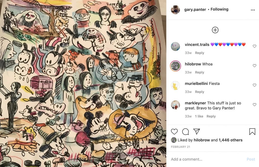
To get back into the swing of dip nibs, I began to copy favorite comic art fragments — Nancy, Mickey Mouse, the Addams Family, Krazy Kat, Richard Scarry’s kittens, Bettie and Veronica, Batman and Robin, the dinosaur hunter Turok, etc. — onto typing paper. (I’m often most interested in background details; and I rarely use anything from the past 50 years.) To learn about drawing, it’s helpful to begin by imitating the masters — or even the second-rate masters — and then applying aspects of what you’ve learned to your own work. By copying a drawing line for line, you discover how lines can regiment or tangle together. I often watercolor over my drawings — I use waterproof ink — and that turned out to be really fun for these ones.
Soon I realized that I wasn’t just test scribbling any longer, so I switched from typing paper to two- and three-ply Strathmore drawing paper with a “kid” (vellum) finish.
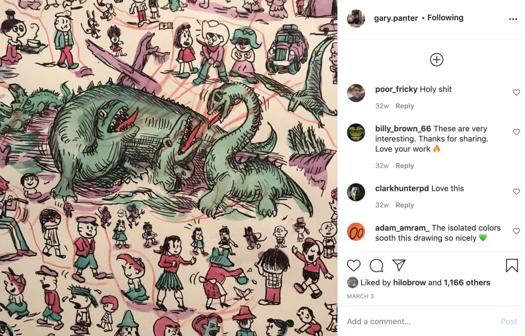
I decided to create a series of related drawings without any intention of trying to communicate any message in particular… but with the understanding that, as often happens with art projects, some meaning might well emerge. My drawings were organized, though not according to any kind of rational scheme. Around this time, my dreams had become overwhelmingly vivid and believable; I was in some place where a line of collaged Victorian houses, piled up many stories high, were visible across a desert valley. Perhaps the organization of my drawings obeys dream logic? At any rate, around the time I started the series — when the Covid-19 precautions went into effect — the dreams stopped.
Printed items from my past — Sunday color comic pages, old wallpaper, pajama textiles, linoleum flooring from the ’30s, coloring books, Popsicle wrappers — still fascinate me. I’m simulating aspects of these things in this series.
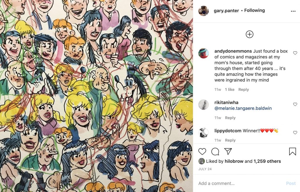
I often have the impulse to “deface” my finished drawings, and normally I resist that impulse. For these drawings to speak, though, defacement seemed like the right thing to do. I’ve added lines that are like kid’s scribbles, flows of water and electrical attractions, groupings and communications between items, the weather in the drawing. I find the effect poetic. The scribbles are related to my own scribbles as a kid, and to other kid’s scribbles. I like to buy old comics that kids have defaced, often by writing their names over and over. Sometimes they’ve scratched out eyes and so on. Or you can see they’ve traced an image — by the pencil pressure marks. Pages that are ripped provide a view through to the next page… which makes me think of excavation and archeology, which in a way is what this whole exercise is.
I don’t plot these drawings, before I begin each new one. Although I have little flickering visions of possible “next” drawings in the series, these are elusive; I’m only able to capture the simplest of these ideas. As I draw, it’s interesting to observe themes emerge that are influenced by things I’ve been reading, and issues that have been on my mind: the forced relocation of Native Americans and the ongoing oppression of African Americans, the role of preachers in fomenting the Civil War, gardening and micro-ecologies, the extinction of species, animal migration, architecture, and so forth.
I don’t try to drive towards these themes, but they present themselves.
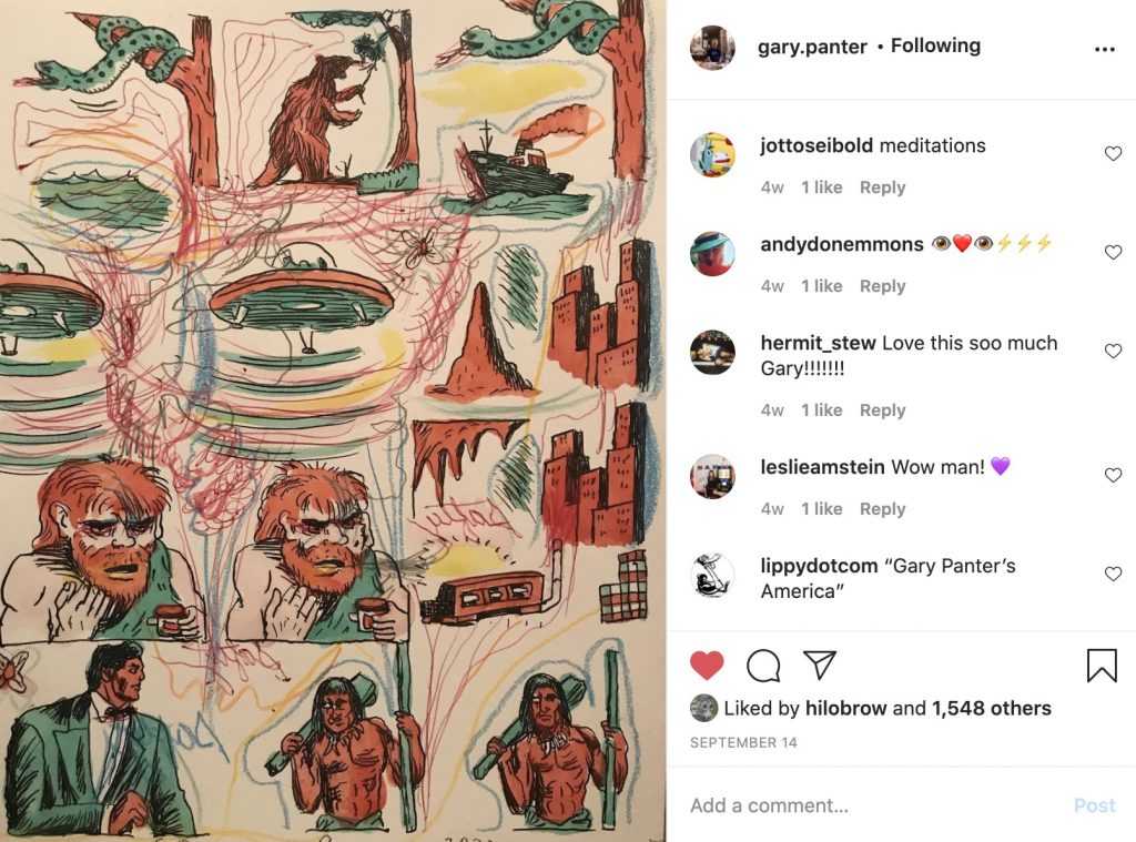
I’ve created over 100 of these drawings, since February. I tend to the series like I tend to my houseplants — that is, with attention interspersed with pauses. Once the series has run its course, I’ll stop adding new installments.
I didn’t set out to do a “Covid-19” series, but circumstances have framed the activity as such. I suggested above that drawings have many uses: Because I’m too worried and distracted to paint, this project is a comfort.
CURATED SERIES at HILOBROW: LINOCUT 2020 by Lawry Hutcheson | CHALK.PRESS by Adam Netburn | PLAGUE YEAR by Rick Pinchera | NOOSFERA by Charles Glaubitz | CENTER OF THE UNIVERSE by Douglas Wolk | A SILENT HALLUCINATION by Alex Gerasev | BUNNY CITY by Gary Panter | HOP UP by Luc Sante | UNBORED CANON by Josh Glenn | CARPE PHALLUM by Patrick Cates | MS. K by Heather Kasunick | HERE BE MONSTERS by Mister Reusch | DOWNTOWNE by Bradley Peterson | #FX by Michael Lewy | PINNED PANELS by Zack Smith | TANK UP by Tony Leone | OUTBOUND TO MONTEVIDEO by Mimi Lipson | TAKING LIBERTIES by Douglas Wolk | STERANKOISMS by Douglas Wolk | MARVEL vs. MUSEUM by Douglas Wolk | NEVER BEGIN TO SING by Damon Krukowski | WTC WTF by Douglas Wolk | COOLING OFF THE COMMOTION by Chenjerai Kumanyika | THAT’S GREAT MARVEL by Douglas Wolk | LAWS OF THE UNIVERSE by Chris Spurgeon | IMAGINARY FRIENDS by Alexandra Molotkow | UNFLOWN by Jacob Covey | ADEQUATED by Franklin Bruno | QUALITY JOE by Joe Alterio | CHICKEN LIT by Lisa Jane Persky | PINAKOTHEK by Luc Sante | ALL MY STARS by Joanne McNeil | BIGFOOT ISLAND by Michael Lewy | NOT OF THIS EARTH by Michael Lewy | ANIMAL MAGNETISM by Colin Dickey | KEEPERS by Steph Burt | AMERICA OBSCURA by Andrew Hultkrans | HEATHCLIFF, FOR WHY? by Brandi Brown | DAILY DRUMPF by Rick Pinchera | BEDROOM AIRPORT by “Parson Edwards” | INTO THE VOID by Charlie Jane Anders | WE REABSORB & ENLIVEN by Matthew Battles | BRAINIAC by Joshua Glenn | COMICALLY VINTAGE by Comically Vintage | BLDGBLOG by Geoff Manaugh | WINDS OF MAGIC by James Parker | MUSEUM OF FEMORIBILIA by Lynn Peril | ROBOTS + MONSTERS by Joe Alterio | MONSTOBER by Rick Pinchera | POP WITH A SHOTGUN by Devin McKinney | FEEDBACK by Joshua Glenn | 4CP FTW by John Hilgart | ANNOTATED GIF by Kerry Callen | FANCHILD by Adam McGovern | BOOKFUTURISM by James Bridle | NOMADBROW by Erik Davis | SCREEN TIME by Jacob Mikanowski | FALSE MACHINE by Patrick Stuart | SIGNIFICANT OBJECTS (cross-posted from Significant Objects website) | UNBORED MANIFESTO by Joshua Glenn and Elizabeth Foy Larsen | H IS FOR HOBO by Joshua Glenn | 4CP FRIDAY by guest curators
