THIS: Drawn in Blood
By:
February 13, 2017
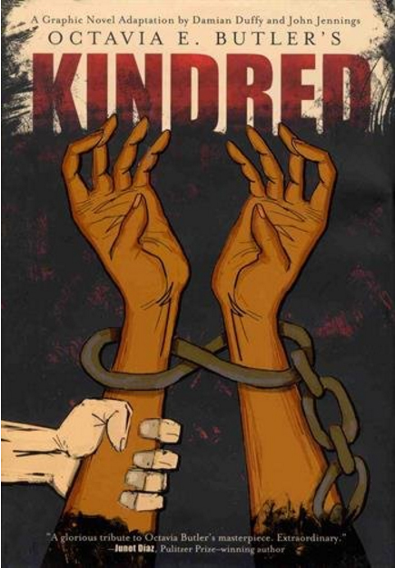
Like it or not, the past is still this country. America is inextricable from the sins of its past, since those sins not only mark us, but made us what we are. The unbroken chain between past and present, and the bond that can be life-bearing or symbiotic between our country’s dominant and subjugated groups, was indelibly dramatized in Octavia E. Butler’s Kindred, her landmark 1979 novel about a contemporary African-American woman, the white husband she forges a life with, and the white ancestor, owner of her enslaved great-great-great grandmother, who she is pulled back in time to meet face-to-face.
The mutual belonging of family and marriage began, in many cases, as the ownership of one human by another, and Butler’s book is a bible of the outright atrocity we come from and the uneasy equilibrium that black and white, male and female, have and have-not struggle to achieve to this day. That waver between then and now is vividly imagined in Butler’s narrative, not only by the way in which the heroine, Dana, repeatedly falls back in time and develops an eerily protective relationship with the petulant, tyrannical yet vulnerable ancestor who must live if she is to be born, and then snaps back to the present with limited time for her husband and her to navigate a now-heightened perspective on the distances between each other’s experience. We also feel a more hopeful jump in time; Dana is the resourceful, dimensional woman protagonist on whose shoulders many later popular heroines (and those inspired by them) stand, and her husband Kevin models the kind of white self-awareness and willingness to dialogue that is only starting to seem contemporary now (and with a Klan-approved White House, a relative term).
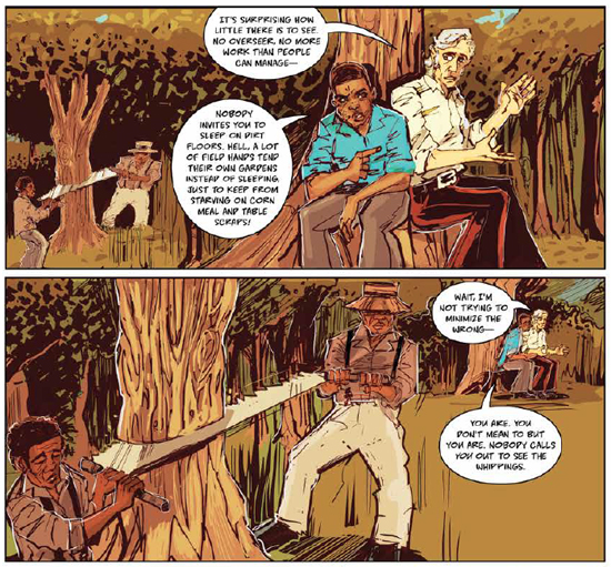
Kindred has travelled through time again, with writer Damian Duffy and artist John Jennings resurrecting this metaphysical classic as a New York Times bestseller-topping graphic novel from Abrams Comic Art. Duffy condenses the novel’s ideas and intensity with incisive instinct, and Jennings breathes life into the hazards and hopes of this existential horror story in ways that engrave it deep in the canon of graphic literature.
Already a winner of the comic industry’s highest honor, the Eisner Award, for co-editing the scholarly volume The Blacker the Ink: Constructions of Black Identity in Comics and Sequential Art, Jennings is one-half of the art team on “Black Kirby” (with Stacey Robinson), a project of studies, exhibitions and comics (the latter with Duffy as well) which remix the aesthetic and immigrant experience of definitive pop-superhero artist Jack Kirby with the visions and concerns of the Afrofuturist cultural movement. A distinguished scholar and practitioner of that movement, and curator of its works in galleries and learning institutions, Jennings was hard at work on concept drawings for a new narrative synthesis of cyberpunk and hip-hop’s Trap culture as part of a current Harvard fellowship when I skyped in to discuss Kindred with him. As legend holds that Kirby did himself, Jennings carried on an elaborate conversation while missing not a stroke on his next great work; that trip to a too-near future will be the subject of next week’s column, for there was much to sort out about the centuries before…
HILOBROW: Some comic and movie adaptations of prose novels — though very few — capture the atmosphere and illuminate the ideas of the book so well that they could substitute for it; many others make such a mess of the original source that they should be avoided at all costs. Kindred is that rare case where it’s equally rewarding to read both prose book and graphic novel; they each have something that sheds light on and expands the experience of the other.
JENNINGS: When we first approached the adaptation, one of the things that was in the front of our minds was to try to make an adaptation that utilized the best aspects of the comics medium. You don’t want to make something where the first thing people say is, “this could have not happened.” We wanted to make something that had the underlying themes of the book, and was the story, but also did something with the medium of comics that the prose novel couldn’t do. The initial script was a lot more meta; it was almost like you had to read the original story to get the whole thing, but then our editor Sheila Keenan, in her infinite wisdom, was like, “No — you don’t wanna create a book that makes people have to go out and get another book.” [laughs] In the rewriting process we came up with something that was a lot more streamlined, and is an homage to the original story but also reified aspects of the emotional content of the work in a way that comics can do.
HILOBROW: In some ways, trading the internal for the external; it was interesting to compare Dana’s inner monologue and impressions from the prose, with the surface expressions and reactions that can’t hide in the visual version…not so much two interpretations side-by-side, but different layers of the narrative; we enter into the work on two different planes. This relates to the art of leaving out — in almost every case, you and Damian did a brilliant job of condensing; almost like an expressive tesseract, where the beginning and endpoints of a narrative thread were folded together, through that third way of reading that graphic narrative’s blend of simultaneous images and juxtaposed words enables. Visual cues, rather than some of the prose book’s full dialogues. Did you and Damian edit each other in terms of what to express in which way?
JENNINGS: I worked from a clean script. I was busy imaging what the space was going to look like while Damian and Sheila toiled away on the script. A lot of those decisions were made before I even came into the conversation with the visuals.
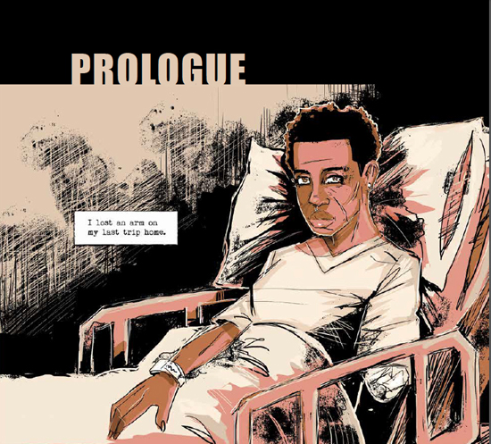
HILOBROW: I liked the way that there’s this saturated vividness to the scenes in the 1800s, while the scenes in the novel’s present-day are in a sepia that we associate with an antique photo.
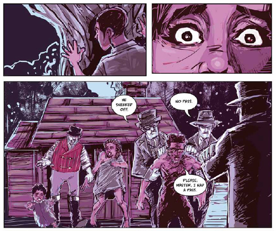
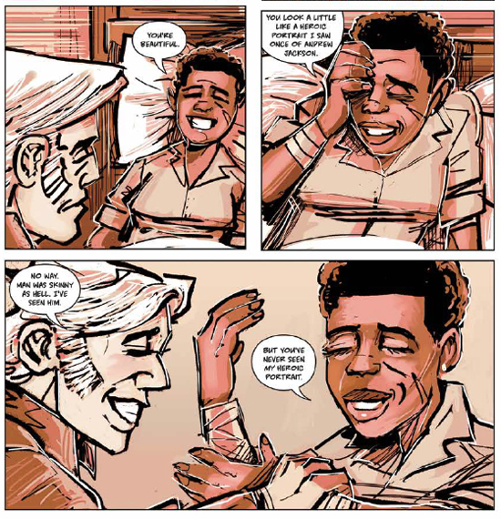
JENNINGS: That was something we decided to do because, in Butler’s original text, Dana talks about how vivid the past was; that was really interesting, that she becomes attached so easily to the past, and there’s this notion of comfort, that she didn’t have in her current state. The other thing is that Dana and Kevin are just now moving into [their first apartment together], so it’s really not their home yet, it’s a place they own, and their stuff is at, so every time you go home, your stuff is still in boxes. In the [prose] book, there’s a point where they’re thawing meat out for a meal, and after this horrendous experience in the past, Dana comes home and the meat still has ice on it. So it’s just disorienting. And then there’s this really creepy sense of belonging to the past, and it’s so bright, and it’s so real. There is a certain amount of surreality that comes with a monochromatic palette. And this monochrome is based off of red, actually. It speaks of a sepia, but I was using maroon and blood-red as a tonal cue. I also used dark reds as color-holds for a lot of stuff even in the past, because the notion of blood kinship, and the power of blood, the connection of genetics, was something that we were trying to get across.
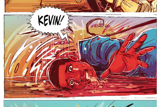
HILOBROW: All the “cinematography” was impressive, including the kind-of German Expressionist psychological palette, coloring realistic scenes in subjective moods.
JENNINGS: Exactly, that’s one of my favorite art movements. When I started thinking about channeling the pain, and disorientation, that they all must have had, it just to me seemed like this kind of grim, grotesque expression. There’s nothing beautiful about Kindred. Nothing at all. That’s how it ended up looking the way, and feeling the way it does. So many people have talked about how disturbing and unnerving the book is, just visually, and so I guess we did a good job with that, because that’s how we felt about it!
HILOBROW: And you referred to the style in an earlier message-exchange we had as “brutalist.”
JENNINGS: I love work that makes me feel like that; it’s able to capture the affect of the atmosphere in the linework, and how things are being portrayed.
HILOBROW: The air itself, the setting is charged with a kind of personality.
JENNINGS: One of my colleagues was saying that the linework made her feel like anything could happen at any moment, and that made her feel uncomfortable. One of my friends — he’s also an art historian — used to say that the way I use line and texture makes it feel like the image is gonna move, step out of the canvas at any second.
HILOBROW: Your use of reverberant line makes it feel to me that there’s this innate motion; that, even at rest, we get a sense of people’s electrons moving in their cells. [laughter]
JENNINGS: I’m really into linework; my influences directly are people like Ted McKeever, and [Bill] Sienkiewicz, but also Denys Cowan and Dave McKean and people like that, who created this painterly, weird, vibratory work.
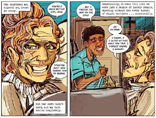
HILOBROW: Also, you have a great visual shorthand in conveying action and expression, and a minimal quality whereby we see only as much as we need to recognize people and to understand what they’re going through; almost like religious stained glass (a form of cultural transmission that would have been very familiar to the characters in the 1800s), or the way that, before photography, the image of monarchs on coins would just be an emblem of their identity because few ever saw them in person.
JENNINGS: I was thinking a lot about physiognomy, and the innate nature of how comics can abstract. So I almost thought of this as being like a really long-form political cartoon. “I’m making a statement, but I’m also doing these crazy caricatures.” And, as a designer, you definitely don’t want to give the eye too much; it’s a very dense story, even in this stripped-down form, and at the beginning I was attempting to put in as much background [as possible], and Sheila was like, “no, don’t do that; you need to strip it down and guide the viewer; don’t focus too much on hyper-detail, just enough to get the story moving.” Some of this was, I wanted to get the immediacy of the moment in my head, so I did a lot of things where, when the action happened, I made it and I just let it be what it was gonna be — I didn’t make anything perfect, I was just trying to capture…this is weird, because even though I was totally conscious, it reminded me of automatic drawing; almost this weird kind of spirit-possession aspect to it. That when I looked at the work, it was what it needed to be. I know that’s a strange statement, but it felt…right to me.
HILOBROW: Sure. And it’s an interesting application of abstract gesturality to a figurative piece; you trust your hand to get down an image that’s supposed to be specifically “about” something.
JENNINGS: The other thing is, people tend to think about this as a science fiction story. And it’s not, it’s a horror story. This is a horrible thing that happens to these people. There’s this notion of perfection in “the future”; a particular kind of visual narrative accompanies fantasy or sci-fi. This particular piece just does not fit in that category. There’s something truly off, and unnerving, about this story. The emotion that I was feeling as I was working on the piece came through in the way that I did it. It feels the way it’s supposed to. Someone who reviewed the book said it gave her nightmares for three days, and I thought, “well that’s good” — it’s horrible that that happened to you, but it definitely is getting across. I think that if you make something a little bit too “realistic” or mimetic, it robs the imagination a bit, and also makes it too hyperbolic; if it’s too like reportage, I think you lose your audience, take them out of the story and turn them off to what we’re trying to get across.
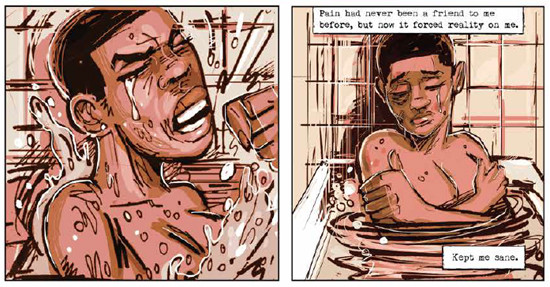
HILOBROW: I think of this graphic novel as being among the gold-standard of representing traumatic subjects without trivializing them or traumatizing the viewer, on the level of the 12 Years a Slave movie, where no gaze is averted, but also nothing is lingered on sensationalistically. But getting back to what you were saying about Kindred being perceived as a science-fiction story…
JENNINGS: It’s got time-travel in it. [laughs]
HILOBROW: …yeah [laughs], but in some ways it’s even less fantastic than Beloved, which is a ghost story in some ways…
JENNINGS: That’s another horror story. I always talk about this area of the “Ethno-Gothic,” which is about how the supernatural can help us deal with different types of traumatic instances. The haunted space is the reification of trauma. Beloved falls in that category, and Kindred, and other narratives that are around slavery and, a particular type of horror that we still have not dealt with. Slavery still pervades [America], in different ways — that’s a ghost story.
HILOBROW: You said there’s nothing beautiful about Kindred, but there is one place of beauty in the whole GN, and that’s the peaceful panoramas that form each chapter-introduction.
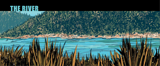
JENNINGS: It’s like the quiet before the storm; those are some of my favorite things. I wanted to mimic the matter-of-factness of her titles — “The Storm”, “The Fight”. There are certain aspects of this particular version of Kindred that also feel very much like a stage-play to me. I think Kindred could be a very interesting play. Because really, there’s not a lot of scenery — you have the woods, the cookhouse; a lot of the action happens in these very specific spaces. I thought of the setups of a play. The chapter-pages feel like title-cards; there’s a sense of serenity to them and they do give us some rest. Because God knows we don’t get a lot of it in that story.
HILOBROW: Another element of horror is that idea of the undertow of time pulling you back into the past…
JENNINGS: Also the physical effect, the body horror of her losing a piece of herself in the past is something that is extremely disconcerting. That’s a different type of haunting. Something else that we tried to play around with was, you probably noticed this, she writes with her left hand a lot.
HILOBROW: I was just gonna ask you about that!
JENNINGS: So we were thinking about, “if she loses her writing hand, what does that mean, as far as her agency, and she’s a writer” — that’s pretty horrible, if that was her strong hand. We show a lot of weird foreshadowing of that. She uses shorthand [when in the past] to tell her story; that’s important. That idea that part of us is still enslaved, or part of us is still in the past.
HILOBROW: My horrific immediate association with that image is animals and humans caught in traps who will remove a limb to get away.
JENNINGS: That’s a good analogy, because that is what the story’s about, to a certain degree: what would you do to survive? What part of us really does survive when we have to sacrifice so much to live. Because she has to do a lot of pretty insidious things to survive. And [her slaveholding ancestor] Rufus is calling her back to him because of survival.
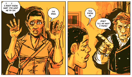
HILOBROW: What you can do with your own hands is a theme with visual signals throughout the graphic novel. You’ve told me how a number of pictorial abbreviations of things described in the prose (or embellishments of scenes not described in the book, like the playful thumb-wrestling when Kevin and Dana are contemplating whether to marry and how their families will view an interracial union), came from Damian’s precise script, but I was curious if it was your idea, much later in the story, when Dana returns to the past and is convincing Rufus’ dangerous dad that he really knows who she is, and she says this in the “hands up, don’t shoot” position.
JENNINGS: Yeah, a lot of that stuff was coming through how I was interpreting the script; that’s one of my favorite things — going back and forth about dealing with what’s going on right now, and making it relevant still [to the past-tense story]; how much of that can we inject, even though those two times are not even close to each other.
HILOBROW: Every period piece be it past or future is really a commentary on the time it’s written in, so to see that very contemporary cue I thought was ingenious. Both Butler’s and your versions of the book convey such a feeling of losing distinction between past and present, and of time subjectively feeling longer or quicker than it really is — how did it feel for you, being immersed in the world of this book for as long as you were?
JENNINGS: I felt like we were enslaved! When it got going, we did this book in about 11 months. I felt like we were always in the world, that we were traveling with Dana, and I guess that’s a good thing because I think we captured the feeling of the book. It reached a point where we weren’t really sleeping a lot; there was a great deal of suffering. [laughs]
HILOBROW: That touches on the issue of experiences relived… what drove you and Damian to re-create this book to begin with? It almost seems like a ritual of re-enacting a work that was particularly meaningful to you — like Butler’s book was the revelation and this version is the gospel of it.
JENNINGS: Both of us really respected and loved Butler’s work, and wanted to do a great job on it. There is this notion of reverence and rememory of how we interpreted the book and how it affected us. It wasn’t in the forefront of our minds, we [just] wanted to make a great version of the book, but there is something to what you say, about us trying to capture the feel and memory of the book.
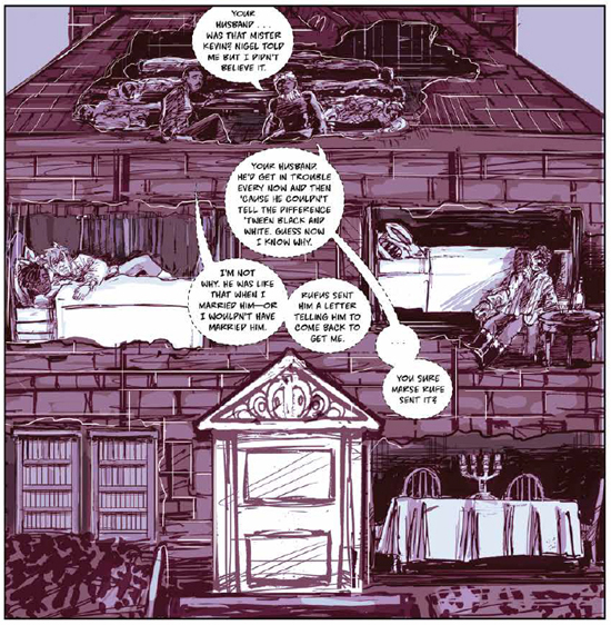
HILOBROW: The book has such a strong undercurrent of stories set down, and lost, and traced back. Early on we see the family tree in Dana’s ancestor’s personal Bible, and you expand on this metaphor with the Eden-like tree that forms the spine of one scene in the past, the simple map of the plantation characters’ limited world, etc. Whose idea was it to do that other spread where we see the panels of the story as rooms in a cutaway of the house?
JENNINGS: That was both of us; again, these are coming from discussions around, how do we show what comics do better than other media. I really like that shot.
HILOBROW: Yeah, it had that tapestry/mandala feel of a simultaneous, multiple narrative — which comics can put together so well.
JENNINGS: It makes sense with the story.
HILOBROW: It’s a partitioned society.
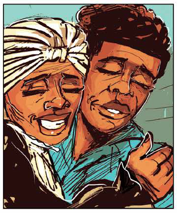
JENNINGS: Another thing about color; you notice that Dana’s always dressed in this kind of turquoise blue color? It’s based off this color called “haint blue” from South Carolina. The Gullah people believed that it was a spiritual color, it would help ward off evil spirits. I thought it would be interesting to have her wearing that color, since in some ways she’s haunting her own existence, her own past. (She also inverts the Magical Negro stereotype in a fascinating way; the Weylin family think she’s there to help them, but she has very much an agenda of her own.) It’s a different location in the South, but this [idea about the blue] was an almost straight-out-of-Africa belief. Also, the kind of gold color we used for night scenes; that was because of the oil lamps, trying to mimic what their lighting sources were really like. So I actually copied and pasted some of the color-choices from Barry Lyndon by Kubrick, so I could really understand what that would look like. Of course, on the color wheel violet is the opposite, so when they’re outside it’s kind of a purple palette, and on the inside it’s the golden color, so they get a sense of safety and discord, derived from color-theory.
HILOBROW: An ironically royal palette, too! Gilding over the horror, and it just happens to be the way things would really have looked. You managed to make the most oppressive-looking warm color I’ve ever seen.
JENNINGS: [Laughs] Yeah, it’s a yellow, but it’s actually still very foreboding.
HILOBROW: Like a tarnished sunlight.
JENNINGS: Yeah, that’s what I liked about it. It fit.
MORE POSTS by ADAM McGOVERN: OFF-TOPIC (2019–2025 monthly) | textshow (2018 quarterly) | PANEL ZERO (comics-related Q&As, 2018 monthly) | THIS: (2016–2017 weekly) | PEOPLE YOU MEET IN HELL, a 5-part series about characters in McGovern’s and Paolo Leandri’s comic Nightworld | Two IDORU JONES comics by McGovern and Paolo Leandri | BOWIEOLOGY: Celebrating 50 years of Bowie | ODD ABSURDUM: How Felix invented the 21st century self | CROM YOUR ENTHUSIASM: C.L. Moore’s JIREL OF JOIRY stories | KERN YOUR ENTHUSIASM: Data 70 | HERC YOUR ENTHUSIASM: “Freedom” | KIRK YOUR ENTHUSIASM: Captain Camelot | KIRB YOUR ENTHUSIASM: Full Fathom Five | A 5-part series on Jack Kirby’s Fourth World mythos | Reviews of Annie Nocenti’s comics Katana, Catwoman, Klarion, and Green Arrow | The curated series FANCHILD | To see all of Adam’s posts, including HiLo Hero items on Lilli Carré, Judy Garland, Wally Wood, and others: CLICK HERE
