False Machine (8)
By:
July 8, 2015
The following post originally appeared at Patrick Stuart’s blog False Machine. It is one in a series of 10 analyzing the mini (miniature figure, used in wargames) and other small-scale fantasy and sci-fi models as an art form.
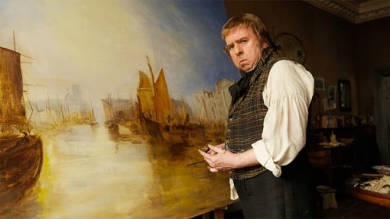
Mike Leigh’s 2014 biopic Mr Turner, about British artist J.M.W. Turner (played by Timothy Spall), is a really good 3D movie.
Turner is continually moving into and out of boxes — and his position in these boxes, or his depth within the box, contextualise, but rarely directly represent, his position in his social world. Leigh’s use of depth is not really a symbol on its own — it’s more like music.
Places this happens:
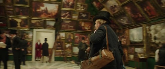
* The Royal Academy of Arts thing.
The walls are tessellated with paintings. The upper walls lean in over the people inside, and are also full of paintings laid almost edge to edge like tiles. Perspective leads us to a door at the back of the first room; inside is another, smaller room — also tiled with paintings like the first.
In his introductory scene to this place, Turner motors around the room, nodding to what we assume are the most successful painters in Britain — addressing them with grunts or first names. Then we get taken through into the back room, where the characters argue. The back room is explicitly stated as a place of less prestige. Painters can trace the arc of their careers according to where they are hung. This is probably the most explicit relation of space to social reality in the film.
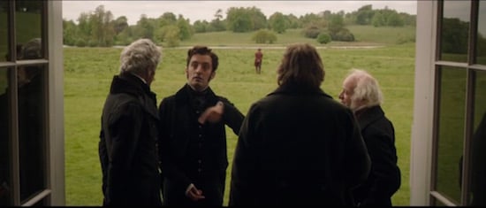
* In a country house with Mr Sickert.
Sickert tries to skive money off some painters. At the end of these conversations he walks off, away from the house, into the meadows.
The camera holds directly in the doorway. The artists indoors frame the shot as they discuss Sickert, disparaging him and pointing out what a fucking drama queen he is. In the centre of the shot, moving in a straight line so that his course deviates neither to the left or right, Sickert diminishes and shrinks as he walks purposefully away from the house, a tiny man growing ever smaller.
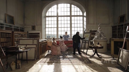
* Turner’s home gallery.
Turner has transformed a central, windowless room in his house into a gallery. He makes visitors wait in darkness till their eyes adjust, then opens the door to his room of images. The light is polarised and white. Inside, Turner’s paintings are scattered chaotically like bright windows into other worlds.
I don’t know if Turner in real life actually did this sort of thing, but in the film it is a powerful piece of stagecraft. It makes sense in terms of the character of the man (you believe the Turner shown would actually do stuff like that), and as a simple but powerful piece of symbolism: the bright room of fine beauty, casually strewn, unseen in the centre, hidden by darkness.
Those scenes have the most distinctive use of depth, the ones in which its use is most clear. But the use of depth in general is a powerful element of the film, usually woven very subtly into its makeup.
Turner is continually approaching and receding from us — never, or rarely, directly like Sickert in the example above, but in more deft movements.
In particular, British social life is presented like a kind of stage set or doll’s house that we are peering into. On a ferry, Turner makes a kind of hook shape through the crowd, moving right across them, then back into the shot and up some stairs; then, on this higher level, he moves left again. As he moves through these people he moves very subtly through some fine divisions of social class. The physical relation of the people shifts a little, as their class shifts.
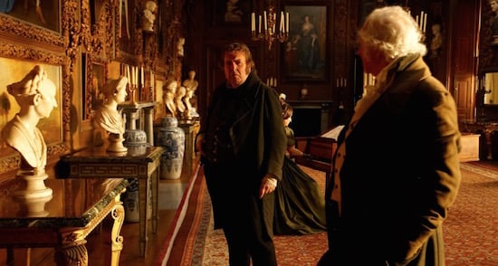
The same is true of a theatre performance in a country house where people are arranged neatly in ranks according to importance, there are lots of neat diagonal interactions across the social space.
Turner goes to a seaside town to paint, he gives a false name to his landlady to avoid attention. This woman lives with her husband, eventually Turner will end up living with her in a different house after her husband dies.
We approach the seaside house from the left, the camera panning right as Turner walks along, he makes an enquiry and disappears inside. Turner’s relation to the house and to the life he will build with this woman is shown by him moving in and out of the depths of this house, going deeper into hallways, behind doors and cupboards. There are no long shots, there are just layers, layers of physical depth and layers of social presence and familiarity.
This gives us some idea of how 3D might eventually be used in films. Right now it’s so expensive that the only thing you can do with 3D is big massive stuff in big massive films. Directly sensory rather than integrated. You are meant to feel the 3D and never forget it.
Since very few films are made to take advantage of the way you can tell a story with actual depth (I think Avatar might be the only one that actually pushed it as a method of storytelling rather than just a cool thing to slather on top), the spectacle isn’t that interesting.
I think learning to use 3D well will be harder than learning to use colour was. It actually works well when it is quiet, when the visual and emotional volume of a scene is temperate and there is not a lot of brain noise, and the things it does, and the way it feathers, cuts across or inflects the emotional impact of a scene or sequence may be much more powerful when subtle than when made a deliberate artefact to which the attention is drawn.
Which is a problem because 3D costs a shitload and, even if it cost less you would still need to wear the glasses and I am not sure you could get people to wear the glasses if the 3D in a film did not draw attention to itself. You can’t really say to an audience, “Hey, put on these 3D glasses, it’ll shift your response to this Chekhov adaptation to an imperceptible yet meaningful degree.” They won’t want to do it.
But if you could deal with the glasses problem and if you could push down the cost of the crap you need to cart around then we could end up in a world where stuff like social drama’s and soap operas are in 3D but blockbuster spasgasms are in 2D.
And then in 90 years a generation will grow up thinking that we use ‘deep’ and ‘shallow’ because they actually refer to the actual depth or shallowness of a piece of media.
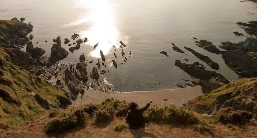
PS: The movie Mr Turner was not actually in 3d, but maybe it should have been — because it was made with a keen eye to the 3rd dimension. In this post, I’ve talked about the film as it should have been, or as I recall it in my mind’s eye… because that was more interesting.
CURATED SERIES at HILOBROW: UNBORED CANON by Josh Glenn | CARPE PHALLUM by Patrick Cates | MS. K by Heather Kasunick | HERE BE MONSTERS by Mister Reusch | DOWNTOWNE by Bradley Peterson | #FX by Michael Lewy | PINNED PANELS by Zack Smith | TANK UP by Tony Leone | OUTBOUND TO MONTEVIDEO by Mimi Lipson | TAKING LIBERTIES by Douglas Wolk | STERANKOISMS by Douglas Wolk | MARVEL vs. MUSEUM by Douglas Wolk | NEVER BEGIN TO SING by Damon Krukowski | WTC WTF by Douglas Wolk | COOLING OFF THE COMMOTION by Chenjerai Kumanyika | THAT’S GREAT MARVEL by Douglas Wolk | LAWS OF THE UNIVERSE by Chris Spurgeon | IMAGINARY FRIENDS by Alexandra Molotkow | UNFLOWN by Jacob Covey | ADEQUATED by Franklin Bruno | QUALITY JOE by Joe Alterio | CHICKEN LIT by Lisa Jane Persky | PINAKOTHEK by Luc Sante | ALL MY STARS by Joanne McNeil | BIGFOOT ISLAND by Michael Lewy | NOT OF THIS EARTH by Michael Lewy | ANIMAL MAGNETISM by Colin Dickey | KEEPERS by Steph Burt | AMERICA OBSCURA by Andrew Hultkrans | HEATHCLIFF, FOR WHY? by Brandi Brown | DAILY DRUMPF by Rick Pinchera | BEDROOM AIRPORT by “Parson Edwards” | INTO THE VOID by Charlie Jane Anders | WE REABSORB & ENLIVEN by Matthew Battles | BRAINIAC by Joshua Glenn | COMICALLY VINTAGE by Comically Vintage | BLDGBLOG by Geoff Manaugh | WINDS OF MAGIC by James Parker | MUSEUM OF FEMORIBILIA by Lynn Peril | ROBOTS + MONSTERS by Joe Alterio | MONSTOBER by Rick Pinchera | POP WITH A SHOTGUN by Devin McKinney | FEEDBACK by Joshua Glenn | 4CP FTW by John Hilgart | ANNOTATED GIF by Kerry Callen | FANCHILD by Adam McGovern | BOOKFUTURISM by James Bridle | NOMADBROW by Erik Davis | SCREEN TIME by Jacob Mikanowski | FALSE MACHINE by Patrick Stuart | 12 DAYS OF SIGNIFICANCE | 12 MORE DAYS OF SIGNIFICANCE | 12 DAYS OF SIGNIFICANCE (AGAIN) | ANOTHER 12 DAYS OF SIGNIFICANCE | UNBORED MANIFESTO by Joshua Glenn and Elizabeth Foy Larsen | H IS FOR HOBO by Joshua Glenn | 4CP FRIDAY by guest curators
