False Machine (6)
By:
July 1, 2015
The following post originally appeared at Patrick Stuart’s blog False Machine. It is one in a series of 10 analyzing the mini (miniature figure, used in wargames) and other small-scale fantasy and sci-fi models as an art form.
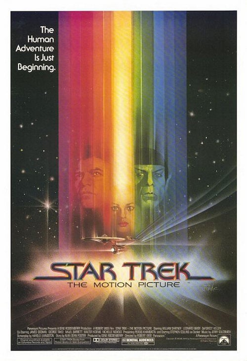
A guy named Thomas Hunt has taken all of the original Star Trek films and cut them down to just those parts that feature ships. So each film is a 5- to 30-minute version featuring just those images of ships or other objects in space. Storytelling with little more than complex objects moving through space.
This post is a consideration of the spaceship scenes in these movies: Star Trek: The Motion Picture (1979), Star Trek II: The Wrath of Khan (1982), Star Trek III: The Search for Spock (1984), and Star Trek IV: The Voyage Home (1986). In the next post in this series, I’ll consider other Star Trek movies.
I watched Hunt’s supercut films backwards, starting with Nemesis and working towards The Motion Picture. It was interesting to see the seismic effect that CGI had on the storytelling of the series. On my first viewing, I assumed the effect of CGI on the storytelling properties of the films was entirely negative — but as I looked more closely, I began to see a more complex interrelationship.
My god, this is a long fucking film. The ship bits are over 25 minutes long — that’s more than twice as much as any other Trek film.
(The total amount of ship footage goes down, after this film, to around 10 minutes. Which is interesting. It seems that even in a series of films about space, people don’t want to actually see that much stuff moving around in space. Budget constraints would be an issue as well, but it seems to me that for most people, the bit with the ships flying about and interacting with each other is not very informationally rich on its own. Like a kind of shadow play or masque in the middle of a naturalistic play.)
The film takes a lot of time looking at the Enterprise, then looking again, then looking some more. It likes looking at everything in space for a long time. Some Klingon ships, a complex grey station in space. Lots of little men floating about in little suits.
The men in suits are important because they bring in a theme that carries through the early Trek films and is largely abandoned by the later ones: that is, illustrating scale by including the human form against the size of the ship.
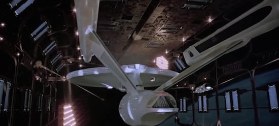
The Enterprise is clean in this film. I didn’t see any aztek’ing (I think its called), which is the fine detailing the model makers put on the surface of the ship at tiny scale to create the illusion that it is a vast thing made of plates and rivets. Or space rivets, or whatever. Aztek’ing is a form of two-dimensional greebling: Greebles are the small things added to models to break up their form and produce the illusion of scale on something quite small. Of course, future ships would very possibly not be made of anything like plates or rivets, even sci-fi versions. So aztek’ing cheats by reproducing the qualities of a modern form (e.g., the aircraft carrier or large naval ship, or the space shuttle) and transposing it onto a futuristic form so we can ‘sense’ the scale with the subconscious process we use in our present for judging the scale of technologies.
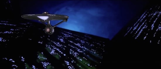
Almost 20 minutes of this supercut film’s 30-minute running time are dedicated to the Enterprise slowly, slowly approaching and penetrating the V’ger space probe. These segments are probably massively overlong for the film, and still feel so in this clip version. Yet, looked at purely as art, they are almost unique in the history of the series.
The V’ger probe is a huge craft, near planet-size, surrounded by a kind of labyrinthine aurora of blue flame that stops you seeing anything within. The scenes of the Enterprise drifting through this alien/elfin/fairyland gigastructure are really remarkably beautiful. We never see V’ger as a whole — but only undergo an almost endless series of penetrations and slow unfoldings as more of its landscape is, piece by piece, revealed. If large sections of the movie’s first part are spent in building up the scale of the Enterprise, in the mind of the viewer, then this later part of the film takes the bold move of pushing the camera right way back — showing the Enterprise as tiny, emphasising its smallness against the blue cityscape of V’ger.
This switching of scale works very well, it shocks our apprehension of size and distance in a way that we expect real space travel would. In space, things are either really fucking far away so that you almost can’t see them, or really fucking close and huge. The human-familiar scale of ‘things that are reasonable size, a reasonable distance away’ wouldn’t occur that much. But this is the distance at which human storytelling can carry most information. You can tell the creative courage of the Trek films by the frequency with which they abandon this ‘comfort zone’ of middle-distance. Good ones are more likely to both push the camera in close and to pull it further away. Bad ones tend to treat the ships as characters in a soap opera, hanging together in the middle distance.
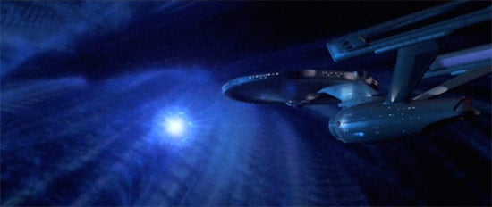
The movement through V’ger is a lot like the movement through a sacred space — a church or temple. An endless opening into deeper and deeper mysteries. Then they get to big space valve and chuck Spock through it so that Gene Roddenberry can further exercise his 2001 gland. Which leads to Spock going through yet another series of doors and portals, describing what he sees.
Of all the Trek films, this one seems most like a kind of collage of other sci-fi moods. It feels very ’60s in some ways. The grey space stations (only the Enterprise is white) feel a little Star Wars. The mood is quite decadent and mystical and dreamy, in a very ’70s way.
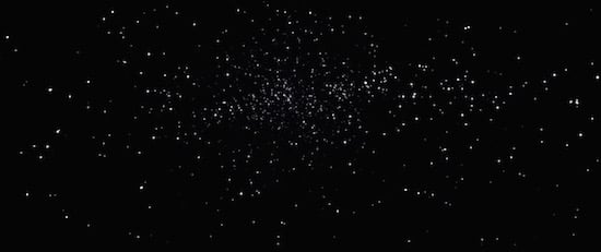
Space is more shadowed almost straight away in WoK. The worlds hang half-shadowed in space and the lighting on the Federation ships creates pools of brightness on their surfaces that also (by necessity) make margins of shadow. We are back with Ruskin and Rodin.
There is a lot more talking over the ship scenes from in-character voices. This almost didn’t happen at all in TMP.
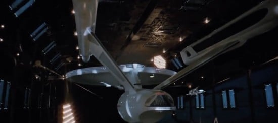
There is still a ‘hero shot’ of the Enterprise where we get to look at her. Despite apparently hanging in the same space dock as in TMP, they seem to have put someone a lot more moody in charge of pointing lamps at the ship. She is not evenly lit, but instead picked out in soft pools of white light. The lights glowing from within the ship can be more clearly seen in the darkness away from the spot lamps. This deliberate patterning of shadow across the ship and the shadows piercing by dots of light generated within the ship will reoccur across the series. It’s a powerful aesthetic effect that can be reproduced by almost no other kind of form.
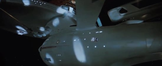
Again we have a little diddy squarish shuttle that is clearly never meant to ever go fast or do anything useful. Perhaps another rule might be formulated that the more boxy and shit the shuttles are in a Star Trek film, the more motion and life the Enterprise will exhibit?
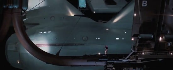
And now we see the aztek’ing. This is the archetypal Enterprise-hero scene. Aztek’ing. Pools of shadow. Self-lit Enterprise. A little space man actually waving to the ship to remind us of scale. Force the camera right in close to the model to highlight its size. Exactly like watching a liner being launched.
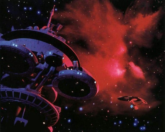
You can tell the story of what happens on the Regula I space station just from the outer shots and the voiceovers. At first, things look peaceful, and we hear a female voice. Then the angles shift as the Enterprise approaches; the Enterprise speaks with Uhura’s voice. Then silence.
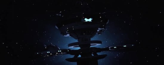
Then the death shot — with the station backlit and turning. Now it looks like a grave or a cross. Actually it looks like a cross within a cross. Almost half of this cut is taken up with the battle in the Mutara nebulae, basically the Wuthering Heights of space. No stars. Space-lightning. Much darker than Star Trek space usually is. Star Trek space is lighter and more brightly lit than real space, so if they want to terrify you with its darkness and impenetrability then they have to invent an new kind of gothic space.
This shot exemplifies the mood:
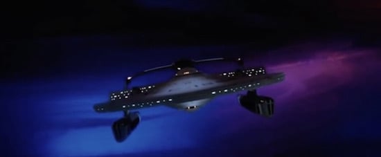
The Reliant drifts out of a patch of darkness, only its hull-lights signifying its shape. The camera flips slowly: far close, far close. Ship-in-distance then near-hull shot. Then here:
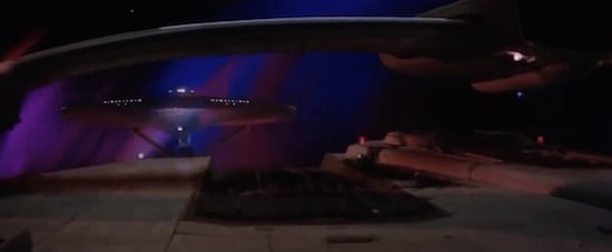
we see the physical logic of the hunt embodied in the shot with the Enterprise rising up, framed by the Reliant‘s superstructure, using the body of the ship as both character and landscape. Sometimes spaceships are like masks, carrying the information of characters; sometimes they’re vast-pseudo landscapes to be traversed; sometimes they’re lonely symbols.
Nimoy is director, and you can tell from the very first scene.
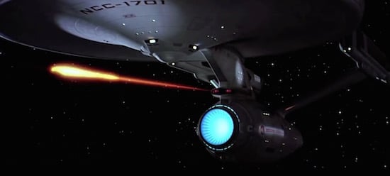
- The Enterprise fires Spock’s coffin in a streak of light.
- The light curls around a newborn world.
- The light becomes a rising sun.
- The camera turns to the world. (Wrong way round for ST, the camera usually turns from the world to space, but we are with Nimoy now.)
- CLOUDS. Now we are in atmosphere. (Nimoy loves clouds.)
- Clouds from below, shot opens up into a forest.
- We drift through the forest, things are getting mystical.
- Spock’s sleek, dark coffin, surprisingly whole in the edenic greenery.
So — from the darkness of space to life and living things. This is going to be a hallmark of Nimoy’s direction.
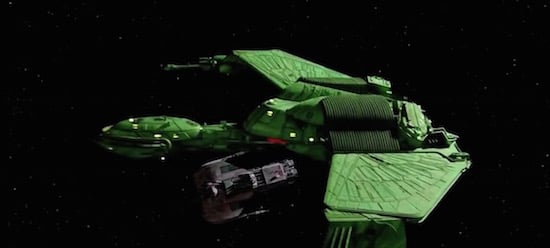
The Klingon Bird of Prey (by Nilo Rodis, Dave Carson and William George) is here to be evil and it looks raw as fuck. This might be my favourite ship from the series other than the Enterprise. It appears directly above a kitbash victim ship, literally spreading wings, with actual wings painted on its fuselage (because Klingons would do that), and strange wing patterns worked into its engineering in the topside. The wing-pattern here is perhaps an alternative to the Enterprise‘s Azteking, designed to create scale, yet also telling a cultural story. If you described this to me I would think it was a terrible idea but it works surprisingly well.
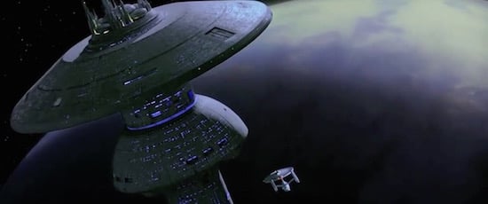
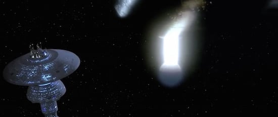
And now the Federation has a big space house to put the Enterprise inside. They must have built that since the last film. The Federation’s tech is now the crème-white we expect instead of Star Wars grey. The lights glimmering inside are a soft blue. The space dock is a big friendly motherly mushroom made of soft regular curves. A civilised city in space. You can tell they have theatres in there, and an arts programme somewhere. The inside of the space house is a lot less moody than in WoK, there is some spotlighting. No tiny space men or people looking out of windows. Lots of little ships buzzing around. Previous versions seemed like NASA-Plus. A little tough and scrappy. Now we are clearly in the friendly utopian future.
Later, as the Enterprise escapes, it’s darker in the space house. The scene is about the Enterprise getting away by stealth so the scene is low lit as if it were night. It makes no sense to have a day-night cycle in the working parts of a space dock, but it tells the story.
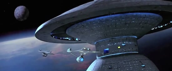
We also get a brief, comparatively gentle chase scene with the Excelsior, a ship designed in the early ’80s to look more futuristic than the Enterprise — and which therefore, to us, seems a bit cheaper since good ’60s design ages better than average ’80s design.
Nimoy uses some of the techniques of WoK in a reduced way, but doesn’t really push them. Space (both outer space and more prosaically, the careful use and management of space in film shots) is not his love. This is a film where we blow up the Enterprise, which falls like a dying angel. The Klingon Bird of Prey escapes and travels to Vulcan to land in some cool spotlights.
From our perspective, we know the Enterprise crew is still alive. But if we look at this series of short films as standalone works of strange art, it looks as if the elemental power of the white ship has strangely been transferred to the violent green ship, which is now peaceful.
This is a very special case. In film terms TVH re-uses the Big Scary Alien Ship With Mysterious-Purpose-Strangely-Linked-To-Earth’s-History trope from TMP. (I need to think of a better name for that trope.)
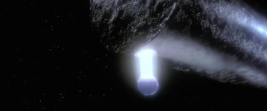
In terms of objects, though, we are dealing with a strange and remarkable cylinder. A black ship wielding a shaft of light and a kind of pale nucleus that spins around like a periscope or sensing eye.
The blackness of the cylinder is curious. It is dark, reflective, and weathered. The weathering and seeming ‘ancientness’ work wonderfully. It is a truly gothic ship — that is, it deals with light in an opposite way than the Federation ships. They are white, self-lit to create layers of shadow, with lights within showing through. But the Whale-Tube is shadow. Its mass is picked out by the gleams of reflected starlight running along its sides, and by the light reflected from its own column of illumination, the only light it gives off.
I could probably write a whole thing on various starship sounds and how they are used in Star Trek movies, but suffice to say the Whale-Tube rolls in on a chundering ‘wub-wub-wub-wub-wub’ mixed with electronica whalesong. It has the most unique sound in the series, a powerful element of its identity.
The Whaletube threatens the Federation by approaching the Mushroom Space House from SFS — darkening it, and turning off its soft blue lights. It also appears directly next to it and is clearly fucking huge.
CLOUDS. We are back with a planetary atmosphere again with the strange sensing of the WhaleTube causing Leonard Nimoy to take a lot of groovy shots of storms and clouds and to reverse or speed up the footage to make them feel weird. Here, for the first time in a Star Trek film, we get an image of a human city. It’s the dreamlike POV of the Klingon Bird Of Prey flying over modern San Francisco at night.
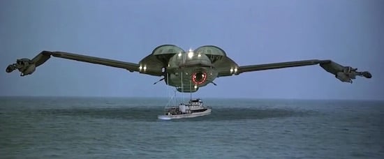
Then a strange chase scene where the Bird Of Prey saves some whales from whale hunters. This is the second time a ship has been used for humour in the film series. (The first was Excelsior’s failed pursuit of the Enterprise in SFS.)
The second half of the edit is made up of the return of the whales to earth. Again, water and cloud play a big part, it’s rare for them to be in a Star Trek film so much. The sequence where the whales apparently communicate with the WhaleTube is shown almost entirely without words or human intervention. Simply movement, shape, and sound. Then we are back in the space house, which is once again full of life. We see the Excelsior again, before a new Enterprise is revealed.
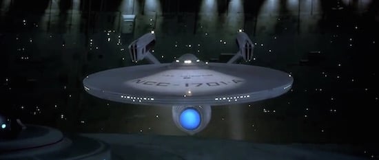
In terms of the boldness of the use of space and the way the ships are interpreted, nothing Nimoy does comes close to WoK. But in the way he assembles the film, and the way he uses the ships as part of the story, his direction is unique. This cut-down version of TVH could be shown as an art film.
Nimoy’s storytelling is so rock-solid you can just pull out the effects alone — and they still makes an entirely coherent film in which the character, needs, and nature of the objects can be clearly perceived. The whale-hunt sequence works perfectly, in an unexpected and charming way, and the appearance of the Klingon Bird of Prey looming over the fishing boat is both utterly strange, appropriate, characterful, amusing and heroic. It could almost be a silent movie. And the tone and feel of this sub-movie matches the tone and feel of the film as a whole. Warm, human and funny.
NEXT TIME: MORE STAR TREK MOVIES CONSIDERED
CURATED SERIES at HILOBROW: UNBORED CANON by Josh Glenn | CARPE PHALLUM by Patrick Cates | MS. K by Heather Kasunick | HERE BE MONSTERS by Mister Reusch | DOWNTOWNE by Bradley Peterson | #FX by Michael Lewy | PINNED PANELS by Zack Smith | TANK UP by Tony Leone | OUTBOUND TO MONTEVIDEO by Mimi Lipson | TAKING LIBERTIES by Douglas Wolk | STERANKOISMS by Douglas Wolk | MARVEL vs. MUSEUM by Douglas Wolk | NEVER BEGIN TO SING by Damon Krukowski | WTC WTF by Douglas Wolk | COOLING OFF THE COMMOTION by Chenjerai Kumanyika | THAT’S GREAT MARVEL by Douglas Wolk | LAWS OF THE UNIVERSE by Chris Spurgeon | IMAGINARY FRIENDS by Alexandra Molotkow | UNFLOWN by Jacob Covey | ADEQUATED by Franklin Bruno | QUALITY JOE by Joe Alterio | CHICKEN LIT by Lisa Jane Persky | PINAKOTHEK by Luc Sante | ALL MY STARS by Joanne McNeil | BIGFOOT ISLAND by Michael Lewy | NOT OF THIS EARTH by Michael Lewy | ANIMAL MAGNETISM by Colin Dickey | KEEPERS by Steph Burt | AMERICA OBSCURA by Andrew Hultkrans | HEATHCLIFF, FOR WHY? by Brandi Brown | DAILY DRUMPF by Rick Pinchera | BEDROOM AIRPORT by “Parson Edwards” | INTO THE VOID by Charlie Jane Anders | WE REABSORB & ENLIVEN by Matthew Battles | BRAINIAC by Joshua Glenn | COMICALLY VINTAGE by Comically Vintage | BLDGBLOG by Geoff Manaugh | WINDS OF MAGIC by James Parker | MUSEUM OF FEMORIBILIA by Lynn Peril | ROBOTS + MONSTERS by Joe Alterio | MONSTOBER by Rick Pinchera | POP WITH A SHOTGUN by Devin McKinney | FEEDBACK by Joshua Glenn | 4CP FTW by John Hilgart | ANNOTATED GIF by Kerry Callen | FANCHILD by Adam McGovern | BOOKFUTURISM by James Bridle | NOMADBROW by Erik Davis | SCREEN TIME by Jacob Mikanowski | FALSE MACHINE by Patrick Stuart | 12 DAYS OF SIGNIFICANCE | 12 MORE DAYS OF SIGNIFICANCE | 12 DAYS OF SIGNIFICANCE (AGAIN) | ANOTHER 12 DAYS OF SIGNIFICANCE | UNBORED MANIFESTO by Joshua Glenn and Elizabeth Foy Larsen | H IS FOR HOBO by Joshua Glenn | 4CP FRIDAY by guest curators
