Bruce Rogers
By:
May 14, 2014

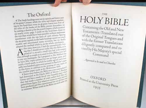
Though Bruce Rogers (1870–1957) rejected modernism in favor of a more classical style, he did not yearn after a mythical past of faeries, dragons, nymphs and merrie olde England framed in ivy like you see in the Kelmscott or Eragny Press books; so it is ironic that the typeface he fiddled with for years, searching after that perfect Roman form, is called Centaur. (To be fair, that just happened to be the title of the first book it was set in.) Centaur, whose most memorable use is in the Oxford Lectern Bible, a huge thing which is almost gaudy in its austerity, harking back to Baskerville’s books with their negative space and lack of ornamentation, remains the most exquisite 20th century imagining of Nicolas Jensen’s 15th-century type and you can still dial up M&H Type and order a brick of it. But I really love Rogers because I ran a used bookstore and every day a river of lousily designed and bound books flowed past. Unlike similarly regarded book designers, Rogers didn’t just design fancy limited editions; you run into his trade books all the time. In a dreary world of Kindles and limply glued hardbacks, Rogers’s work is indestructible and perfect — a reminder that books can be lovely and readable at the same time.
***
On his or her birthday, HiLobrow irregularly pays tribute to one of our high-, low-, no-, or hilobrow heroes. Also born this date: George Lucas, Ed Ricketts, Wim Mertens, Dan Auerbach, Thomas Gainsborough, David Byrne.
READ MORE about members of the Anarcho-Symbolist Generation (1864–73).
