Art and the Restoration
By:
August 24, 2012

To quote the incomparable Coach McGuirk: “Settle down, listen up.” Yes, this is about that painting.
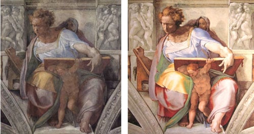
Now, the thing about art restoration is, obviously, the restoration part. It’s supposed to restore something to its original, or at least previous, state. Even if that’s a state that no one living has ever seen, or even quite imagined (pace the Sistine Chapel). Whether the original was really art or not is assumed; or at the least, left… open.

We have seen meticulous restoration done on sliced or damaged canvases. We have watched as restorers rebuilt Jay DeFeo’s The Rose from the back, filling in unstable gaps and rebuilding hardly-there adhesives, so it did not (yet) collapse under its own impossible weight. We have heard curators sigh over whether or not to include a (new) (re-smoked to the correct length) butt in a Pollock whose elements have gone partially missing. There are all sorts of things people do to art: there’s cleaning, there’s viewing, there’s yarnbombing, there’s reinterpretation, there’s trademarking, there’s issuing official postcards…
And then there’s this.

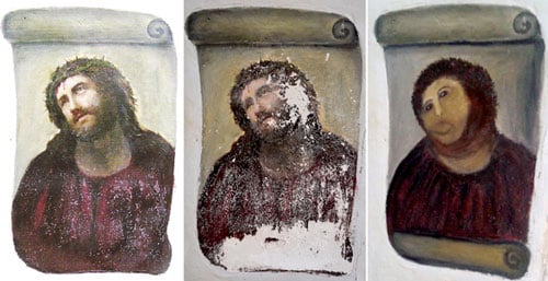
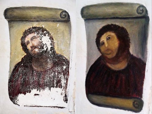
In which, in case you missed it, Cecilia Giménez, an 80-something local art enthusiast, attempted some fresco restoration on a recent (1930s) and poorly-kept (humid, IRL conditions) headshot, by Elías García Martínez, of our everyman Jesus, originally painted somewhat abruptly on a (painted) scroll, on a (painted, but not like that) pillar. All was more or less well, or at least no one cared too too much, while she tackled the edges, mixing pigment, plaster, and the Peter Principle to fill in and symbolize His Robe. However, that only made the Flaking Face seem even more of a disaster, and she continued on. She was not, it should be noted, “done,” when she was stopped.
So the attempt; now, the result. It certainly doesn’t look like the original with a few gaps filled in. So considered as a restoration, it has clearly gone awry. But considered as art… yes, let’s grapple with realism. Sure, the original, even with its missing flakes, used correct anatomy, proportion, color theory, and technique to make Jesus’ face look like a real face. Except it probably didn’t really look like Jesus. Putting aside the whole God question, I’d wager good odds that any historical Jesus didn’t look like a 19th century son of proper European bourgeois parents, squandering his inheritance on a misguided attempt to break into a passion play, before settling down and taking a job at the bank. So then this was García Martínez’ personal Jesus — and a very familiar personal Jesus, as anyone who has spent any time in churches in Europe, or galleries in the Louvre, or alcoves in Saint Patrick’s, or any comprehensive art-history tome, can confirm with exhaustive certainty. Realism Jesus loses even His efficacy as a symbol when overdeployed as he has been. “Oh, that image again,” and one’s eyes glaze over. No, what was interesting, artistic, about this particular painting was at best its weird decapitated placement on a hasty, primitive scroll, on a lone pillar, at more or less eye-level. In other words, its unreal elements.

This new version is clearly less realistic, less skilled in a number of ways. But in other aspects it is not so distant from the stylized Byzantine iconography that preceded the vanishing points of early 3D. Add a little gold leaf; perhaps even let Giménez “finish”… This version is more lively than the original. Of course it’s not representative of a human skull, or skin, or even a proper robe for that matter, but it’s got style, movement, an inadvertent humor. Look at those eyes! There was no reason to even touch the eyes, but here they’ve been brought into line with the new look, and are looking askance at something in particular, not up to heaven. Perhaps they are looking at that wayward restoration brush the same way that Daffy Duck looked at that giant eraser, bearing down on his outline…
Ok. Art has, not rules, but guidelines, and vague ones at that. Not every brushstroke is good. Not every outsider artist should get in. Maybe! But it’s subjective, and even taken case-by-case it is sometimes unresolvable. The lines are drawn, and erased, and drawn again. But: I invite you to imagine this entire church redone in Giménez’ style. It would be swirling, surrealistic, primitive, unpredictable. It would not represent human shapes like a photograph, or a camera obscura. But might it not represent something more “of the spirit?”
Like graffiti, like the glitch, like noise, like fragments, like any unexpected shift in our aesthetic frame of reference — sometimes you just need to let go for a moment, and say to a thing: “you may be wrong, for all I know… but you may be right.”
Sign the petition to preserve the new version: [Save It!].

