Btoom! Kirby vs. Lee (5)
By:
July 2, 2011
Over the years, I’ve seen many criticize Jack Kirby, going so far as to blame him for creating the now popular genre of oversized men in tights colliding — giants with ridiculously exaggerated, unrealistic physiques beating the hell out of each other. I don’t think it’s fair to blame Jack for coming up with his own stylized, idealized form of terrestrial cosmic combat. I think Jack was simply reflecting his own experiences and artistic sensibilities, and it just so happens that his approach to comic book combat choreography worked during the Sixties — readers loved it and bought up his books in droves — and Jack’s graphic methodology continues to resonate with audiences today, exemplified by popular WWF wrestling and all of the various extreme boxing shows, superhero video games and cartoons, many of which are being created by artists influenced by Jack.
[HiLobrow recently published a series of 25 posts, by 25 authors, each analyzing a single panel from a Jack Kirby-drawn comic book. That series was followed by additional Kirby exegetical commentaries, of which this series of five posts by Rob Steibel is the final example. Series intro here.]
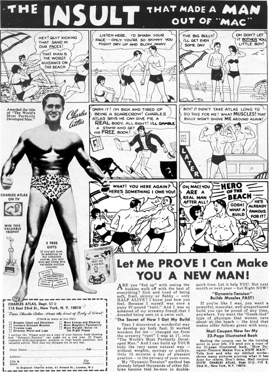
The actual physical expansion of Kirby’s character’s anatomy was probably based on Kirby always innovating — trying to come up with new, dynamic ways of portraying heroes within the constraints of a rectangular comic book frame. This resulted in Jack’s famous “blocky,” “rocky,” square-jawed style, where characters seemed like they were being crushed into square figures by the four sides of the comic book panel. On the other hand, Jack’s characters seemed as if they wanted to burst out of the proscenium arch of their comic book prison. The 3-D effect Jack achieved where a character looked like his fist was flying right out of the panel was due in large part to Jack’s experimentation with perspective but more specifically thanks to his mercurial “squiggles” which gave the characters the illusion of flowing movement. But I think Jack’s late 1960s characters were also a reflection of a physical change Kirby was observing that had been taking place since the Depression. If you look at Jack’s characters from the 1940s through the early 1960s, they’re fairly skinny and gaunt, just like most regular people from that time period. Then especially during the 1960s, partly influenced by advertisements featuring bodybuilders like Charles Atlas for example, Americans were becoming healthier, more physically fit, and many young people gravitated towards literally larger-than-life heroes, so I think Jack is beginning to reflect this more and more in the visual design of his heroes and villains physiques.

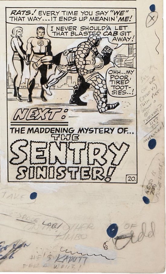
For example, here is one additional panel from the original artwork for Fantastic Four # 63 that I think exemplifies Jack moving in this direction. This is the final panel from page 20.

First of all, the margin notes at the bottom of the page are a mess. Several different layers; some text has been scratched out; whoever added the white-out to the last panel was probably testing the consistency there on the bottom, so I’m not even going to try and decipher that information. But, on the right side of the page, Stan Lee’s notes say: “Sol, can we (John V.) thin Reed down a bit throughout? He’s too muscular!”

I’ll guess that John V. is John Verpoorten who started off at Marvel in 1967 as an inker and then eventually became a production manager. Because this artwork is now considered a high point in comics art, it’s kind of hard for me to believe Lee would want someone to go through the entire book and change Mr. Fantastic’s physique in each panel. You’d think that would have resulted in a mess — a mismatch of styles — plus it would have wasted a lot of time. Luckily somewhere along the chain of command the decision was made not to make those revisions, but one has to wonder why Lee would even consider making that kind of change. Especially to a character who could stretch — surely if Lee was bombarded by reader complaints, he could simply say, “Well, Reed is stretching!”
Kirby Historian Mike Gartland wrote a series of articles for the Jack Kirby Collector called “A Failure to Communicate,” where he examined Jack’s margin notes and discussed examples where Stan Lee made changes to Kirby’s initial story. I think “a failure to communicate,” is definitely an accurate way to describe the Kirby/Lee relationship towards the end of their collaboration, but looking at the margin notes in this panel, the term I would use in this particular instance would be: “tug-of-war.” I think Kirby and Lee are moving in different directions.

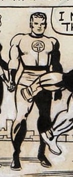
As I mentioned before, as editor, Stan Lee pays a lot of attention to continuity. He’s very interested in the characters looking the same from issue to issue and acting the same — this makes the characters easier to market. Jack on the other hand is moving ahead full throttle like a runaway freight train — he’s not concerned with making characters and costumes identical from issue to issue — or even from panel to panel. This image is a great example of where Jack is pushing the boundaries. No longer is Mr. Fantastic the scrawny depression-era character who appeared in Fantastic Four # 1 (Nov 1961). Reed Richards is changing — morphing into a more physically powerful presence.
I think this panel symbolizes the beginning of the end of the Kirby/Lee relationship. Stan is focused on the business of marketing the characters, he has an almost production-line mentality; whereas Jack is focused on the stories and art, constantly striving to be more innovative and imaginative. Kirby seems interested in pushing the boundaries — taking advantage of the comics medium to express his own vision and passion — while Lee is more focused on the business end of the equation: keeping the characters fairly simple, conservative, and… the same.
Because Lee wasn’t willing to give Jack a very clear “writer” credit for his stories, and it became apparent to Jack that Martin Goodman wasn’t going to give him promised royalties for his creative input into the Marvel empire, in the late-1960s Kirby would stop giving Stan Lee new characters, and by 1970 Jack would break up the team — Kirby would go on to work for DC comics, and Lee would slowly phase out of his role as editor/writer, becoming more of a Marvel cheerleader and salesman out on the west coast. But when this page was produced in the summer of 1967, I think it’s pretty obvious that Jack was having a lot of fun. The margin notes on the other pages from this period are equally light and freewheeling. Kirby seems to have been at a place where the ideas were pouring out of him — and he loved it. Plus Jack had an inker like Joe Sinnott willing to put in the extra time and energy in order to make the artwork really shine. This was surely a high point in Jack’s career. Some would argue this was a high point in the history of the comics medium.
Jack’s combat choreography which you can see a glimpse of on that single page of 1966 Fantastic Four artwork was like nothing else in comics at this time. Even reading the reprints of this material in the late 1970s, I found Jack’s imagery much more interesting and exciting than any other comics artwork being produced at that time. In fact, I don’t think either of the recent Fantastic Four films — Fantastic Four (2005), Fantastic Four: Rise of the Silver Surfer (2007) — came close to capturing the remarkable Kirby kaleidoscope of innovative designs, stories, and concepts cranked during Jack’s 10-year run on that property; technology may never be able to duplicate Jack’s unique visual palette. I think the Kirby/Sinnott combination (two of the hardest working artists in the industry joining forces) resulted in illustrations that transcended the comics medium. In the context of the psychedelic 1960s — long before cable TV and the internet would dominate communication — Kirby/Sinnott artwork set the benchmark for innovative and exciting superhero storytelling that may never be surpassed.
In the future, I’d love to see Marvel Comics reprint some books featuring photographs of Jack and Joe’s original art at its actual size — that would be a great way for fans to see HQ copies of the art with no loss of a generation, and they can really appreciate the scope and grandeur of Kirby’s visuals. I’m also hopeful we’ll see Marvel and DC get behind a comprehensive documentary film that celebrates the life and work of Jack Kirby — many may find his life story inspiring. Kirby survived the great depression, was a patriot who served his country with distinction during World War II, and a true hero of the imagination. Currently Jack’s children and grandkids are fighting their own battle with the Marvel lawyers over the copyright of Jack’s Sixties Marvel creations. I love a happy ending, so I hope the new Disney-Marvel conglomerate will reach some kind of fair settlement with Jack’s family, and Marvel will work with the Kirby Estate to celebrate Jack’s extraordinary run at Marvel Comics from 1960-70.
CHECK OUT “Cosmic Debris: Kirby in the ’70s,” a series that ran in tandem with “Kirb Your Enthusiasm” at the 4CP gallery of comic book details | Kirby cutaways and diagrams collected at the Comic Book Cartography gallery | Joe Alterio’s Cablegate Comix and HiLobrow posts about comics and cartoonists, and science fiction | The Jack Kirby Chronology | scans of rare 1940-50s Kirby comics at the Digital Comic Museum
KIRB YOUR ENTHUSIASM: Douglas Rushkoff on THE ETERNALS | John Hilgart on BLACK MAGIC | Gary Panter on DEMON | Dan Nadel on OMAC | Deb Chachra on CAPTAIN AMERICA | Mark Frauenfelder on KAMANDI | Jason Grote on MACHINE MAN | Ben Greenman on SANDMAN | Annie Nocenti on THE X-MEN | Greg Rowland on THE FANTASTIC FOUR | Joshua Glenn on TALES TO ASTONISH | Lynn Peril on YOUNG LOVE | Jim Shepard on STRANGE TALES | David Smay on MISTER MIRACLE | Joe Alterio on BLACK PANTHER | Sean Howe on THOR | Mark Newgarden on JIMMY OLSEN | Dean Haspiel on DEVIL DINOSAUR | Matthew Specktor on THE AVENGERS | Terese Svoboda on TALES OF SUSPENSE | Matthew Wells on THE NEW GODS | Toni Schlesinger on REAL CLUE | Josh Kramer on THE FOREVER PEOPLE | Glen David Gold on JOURNEY INTO MYSTERY | Douglas Wolk on 2001: A SPACE ODYSSEY | MORE EXEGETICAL COMMENTARIES: Joshua Glenn on Kirby’s Radium Age Sci-Fi Influences | Chris Lanier on Kirby vs. Kubrick | Scott Edelman recalls when the FF walked among us | Adam McGovern is haunted by a panel from THE NEW GODS | Matt Seneca studies the sensuality of Kirby’s women | Btoom! Rob Steibel settles the Jack Kirby vs. Stan Lee question | Galactus Lives! Rob Steibel analyzes a single Kirby panel in six posts | Danny Fingeroth figgers out The Thing | Adam McGovern on four decades (so far) of Kirby’s “Fourth World” mythos | Jack Kirby: Anti-Fascist Pipe Smoker | BTOOM! Kirby vs. Lee, by Rob Steibel
SIMILAR HILOBROW SERIES: SECRET PANEL —Silver Age comics’ double entendres | SKRULLICISM
