4CP FAQ
By:
June 10, 2011

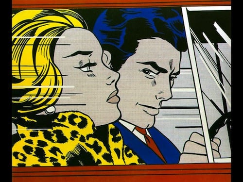
A while back, in a post on art movements of the Postmodernist Generation, I compared the nobrow (disengaged) irony of Pop Art with the hilobrow (engaged) irony of Neo-Dada. Pop Artists like Roy Lichtenstein and Andy Warhol, I suggest, can be inspiring in their critique of the limitations of the High/Low/Anti-High/Anti-Low brow matrix. However, precisely because Nobrow is so disengaged, it is easily suborned by Middlebrow — and transformed into quatsch.
Our friend John Hilgart recently explained what his 4CP blog is all about, and discussed its aesthetics. It’s a great read; I was particularly interested to see him compare Jack Kirby’s work with Lichtenstein’s and Warhol’s. His critique of these Pop Artists chimes with my own, I think.
Excerpt:
Q. What do you think about Roy Lichtenstein?
A. I like him a lot, but the perversity of his simulated enlargements of comic book details is that their precision negates what actually happens on the pages of 20th century comic books. Whereas chaos reigns on the craggy surface of wood pulp that has been blasted by successive printing plates, Lichtenstein is the Mondrian of comic book aesthetics. No matter how far from his dots you stand, you’ll never see green. He celebrated a mechanical precision and an idealized four-color process that the comic books never had.
I believe that in the ‘60s and ‘70s, Jack Kirby developed an opposing meta-aesthetic of comic books. He embraced the underlying chaotic, radioactive dots and force fields of the printed page, and he enlarged them into entire galaxies and negative zones. When the Fantastic Four dove into another dimension, they were diving into comic books themselves, shooting past four-color planetoids and through the wavy energy of bleedy black ink. Kirby’s cosmic crackles are benday dots that have gone supernova and collapsed into black holes.
Within Sixties fine art, I think Warhol’s screen prints are closer to the texture and visual experience of an enlarged bit of color process printing. It’s the calculated sloppiness of his work, as well as his dots. His coloring is painterly, not mechanical. His broad strokes are comparable to those of a comic book color separator’s brush, and he’s out of register when it suits him. What’s great about cheap mechanical printing is that it doesn’t look mechanical when enlarged. It’s imprecise. It’s accidentally subjective. It’s full of gestures above and beyond those that were intended. That’s what makes it iconic. That’s why it’s hard to fake with computer design.
CHECK OUT the HiLobrow series 4CP FRIDAY and 4CP FTW. Also check out our Jack Kirby series KIRB YOUR ENTHUSIASM.
