Best of Brainiac (1)
By:
January 24, 2010
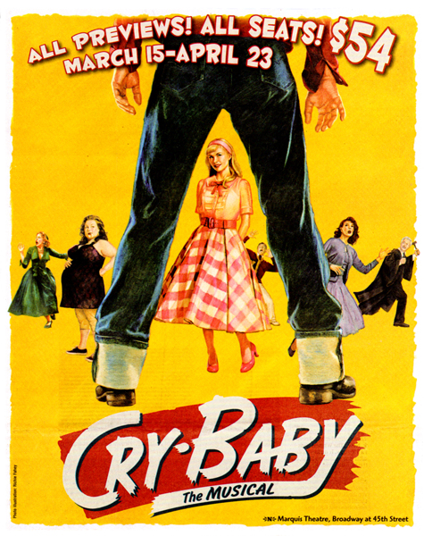
In the latest issue of Print Magazine, the graphic designer and design critic Steven Heller introduces perhaps the most ineradicable of all design viruses: the cutoff-torso-spread-leg framing device known as the “A-Frame.” Digging into the archives of his frequent collaborator Miro Ilic, Heller makes a case that the A-Frame “is the most frequently copied trope ever used.” Alas, he concludes, “on book covers and on film and theater posters, the leg has evolved very little.”
[A slightly different version of this item originally appeared at the Boston Globe Ideas section’s blog, Brainiac, in May 2008.]
At the level of form, Heller may well be correct; at the level of content, however, a glance at Ilic’s collection indicates that the A-Frame has indeed evolved — keeping pace with and reflecting (if grotesquely) dominant cultural codes.
The earliest known uses of the A-Frame device were 19th-century engravings that showed spread-legged slave masters lording it over their cowering victims. The earliest examples provided by Miro Ilic — i.e., the covers of sleazy 1940s pulp fiction — we can see that the A-Frame design virus’s original instantiation is still with us. Women are framed by the legs of their male tormentors.
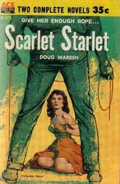
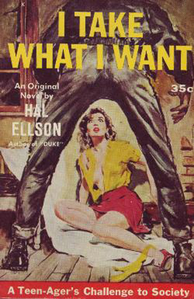
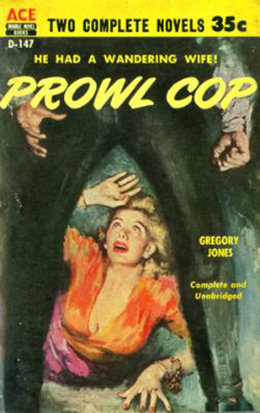
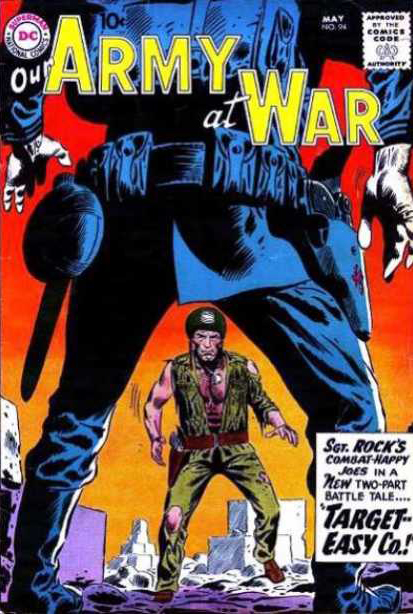
On the cover of pulp Western novels, however, we see spread-legged men confronting not women, but other men. Who are not helpless or passive, and therefore not objectified in the same way as the women in the images shown above. These figures retain agency. Gender plays a key role, it seems, when it comes to the A-Frame device.
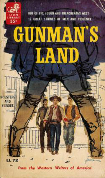
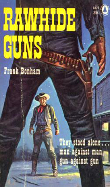
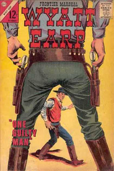
Even the few cowering subjects on the covers of these pulp westerns retain agency.
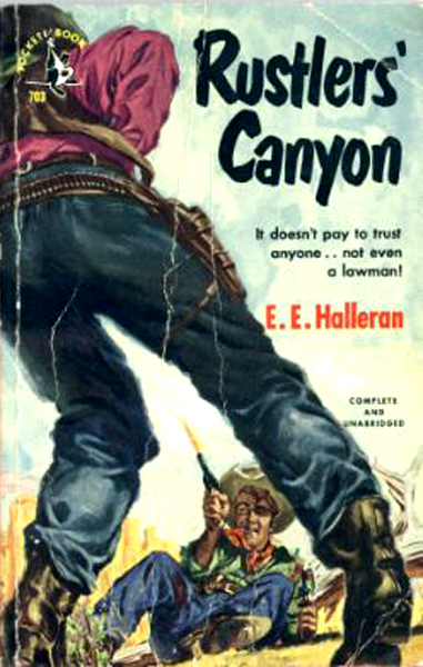
When the gender roles are reversed — when women’s legs form the A-Frame, and men are framed by them — what happens? Men don’t merely cower and grovel, they die. Forget the bourgeois master-slave dialectic: in the anxious fantasies of male pulp writers and illustrators, when women finally get off their backs (and bellies) they aren’t going to dominate men. No: they’re going to exterminate them.
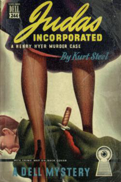
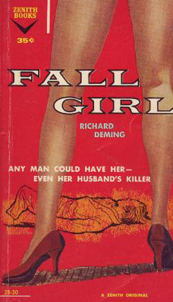
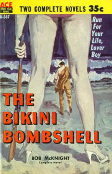
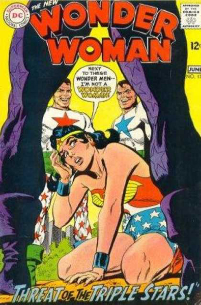
Heller was off-target when he suggested that all A-Frames are alike: gender is a critical differentiator. However, because gender roles didn’t evolve much until the 1970s, it’s true that the three scenarios outlined above remain constant until then. See Irv Novick’s cover for Wonder Woman #176 (May-June 1968), for example:
Also see Joe Kubert’s pulp western-style cover illustration for Our Army at War #94 (May 1960):
However, when we jump ahead to 1981 (which, according to my periodization scheme is actually part of the Seventies: 1974-83), on the poster advertising For Your Eyes Only we find an apparently radical updating of the pulp western-style A-Frame device. Here, we’re viewing one gunslinger through the legs of the other, and both have agency. Yet the A-Frame is a woman’s legs. How feminist, how egalitarian!
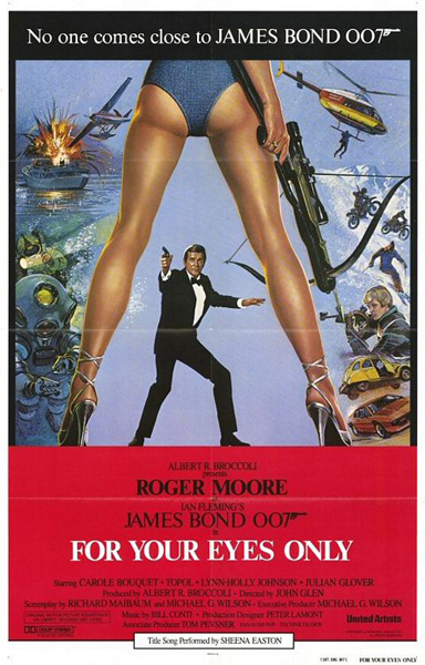
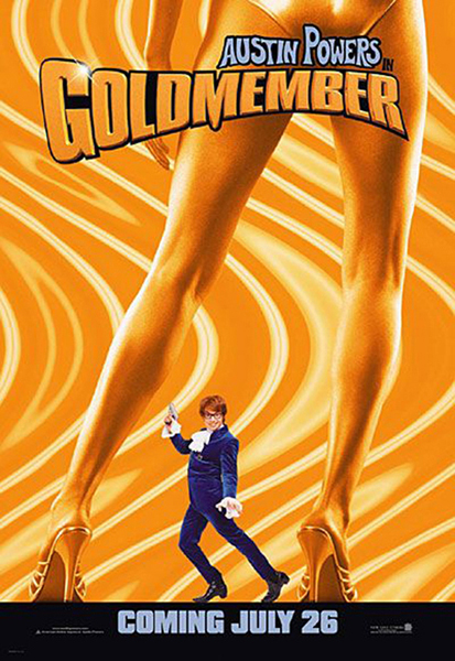
Of course, the Bond poster wants to have it both ways. The framing legs belong to a woman who is both gunslinger and sexpot, mastering subject and object of desire. Not until Mike Myers’ 2002 parody of James Bond, however, do we see a male object of desire between a woman’s framing legs. Talk about a revaluation of all values!
In September 2006, Joshua Glenn launched Brainiac, a blog published by the Boston Globe’s Ideas section. He retired from Brainiac in June ’08, to pursue new projects; in February ’09, he cofounded HiLobrow.com. This post is the first in a series of ten commemorating Glenn’s brief tenure as a professional blogger.
