The Cinematic Possibilities of Pop-up Books
By:
November 23, 2009

At Slate last week, Troy Patterson argued that books don’t need to be promoted with the kind of flashy, light-beer cinema that is the phenomenon of the “book trailer.” At Snarkmarket, however, Matt Thompson offers a spirited defense of book trailers, comparing them to food photography:
I don’t think of the primary seduction of a meal as being visual, but a well-done food photo evokes everything non-visual about a meal — taste, scent, texture. Similarly, I don’t typically think of the primary seduction of a book as being its atmosphere or aesthetic, but this is what a good book trailer (or animated book cover) evokes — the environment the book will create around you as you read it.
Matt links to his Snarkmarket colleague Robin Sloan’s experimental trailer for his much-anticipated Annabel Scheme. But he also refers to this trailer for a new, pop-up edition of Antoine de Saint-Exupéry’s classic, The Little Prince:
Matt’s right: it does the job; the pop-up Little Prince looks fun. But I’m not very impressed with the trailer as film— hands fumbling here and there, playing with out-of-focus bits of paper engineering. I’m setting the bar absurdly high, I know. But the pop-up, after all, is the book that doesn’t want to be a book; it seems rife with cinematic (well, at least cartoonish) possibility. Imagine pop-up books animated by Jan Svankmajer, or the photography of Abelardo Morell translated into cinematic form.
Thus inspired, I went looking for examples of pop-up books brought to life through the magic of film. Alas, the search was mostly disappointing — although there were a couple of delights along the way. What follows is a somewhat-glibly annotated collection of pop-up videos.
The first example, a pop-up tie-in with the hit musical adapted from Gregory Maguire’s Wicked, is a disaster:
…while this trailer for a pop-up produced by Sports Illustrated is even worse, with its little Tiger Woods paper doll trembling in a coloring book grove:
How can they get it so wrong? The video below, produced in connection with an exhibition at the Cooper-Hewitt Museum, while being primarily a curatorial document, shows what careful lighting and precisely-framed shots can do for the pop-up book:
…but the pacing is too slow; the story the book tells isn’t dramatized; and those hands! They’re stagehands, people — dress them in black. Or make them disappear altogether; bring us the suspended disbelief and the sense of sheer nickelodeon charm that makes a good pop-up work.
The next trailer, for Maurice Sendak’s tour-de-force pop-up Mommy, suffers bookending by a presenter whose face seems frozen in an ecstasy-induced rictus. But the rest of it works very well by cutting between takes of interview with Sendak and his collaborators interwoven with well-produced shots of the paper engineering:
Better! But it’s still a marketing ploy, of course. The trailer below, for Marion Bataille’s ABC3D, gets much closer; it teases out the book’s flavor with a well-chosen soundtrack. Hands are present — but stop-motion animation renders them toylike in their own right:
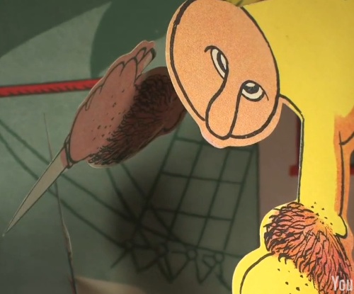
The best examples aren’t trailers at all. Instead they reverse polarity by deploying the pop-up book as a model for animation not related to actual books. Like this short in which a Japanese-themed pop-up comes to life:
…and this advertisement, in which a specially-made pop-up is deployed to greenwash a British cleansing product:
The piece that comes closest to realizing the pop-up potential doesn’t use a pop-up book; instead, it discovers the latent will to pop-upness lurking in any book:
…a trifle slick, perhaps. But it comes closer than anything I’ve seen to Svankmajering the pop-up. It makes me want to find an old pop-up book — maybe one that’s in the public domain, maybe one in a foreign language — find myself an enterprising filmmaker, and see what else can be done. Clearly, the pop-up book trailer awaits its auteur.
