Kern Your Enthusiasm (19)
By:
August 19, 2014
One of 25 installments in a series of posts analyzing and celebrating a few of our favorite (and least favorite) typefaces. NOTE: This is one of the 25 most popular posts ever published at HILOBROW.
CHICAGO | SUSAN KARE | 1983
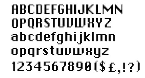
It was square, squat, and inherently cute. It was friendly. It was easy to use. I’m talking about the beige box with the blue grinning face that came to live with us in 1985. But I’m also talking about the font that came with it. It was the typeface Chicago that spelled out “Welcome to Macintosh,” ushering us into a new age of personal computing. But it was also a new age for digital type. Here was a typeface created explicitly for the Macintosh, part of designer Susan Kare’s strategy to customize everything from the characters to the icons — that happy computer, the wristwatch, an actual trashcan — to make it feel more human and less machine.
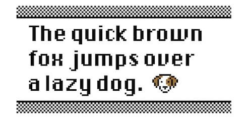
Most of us couldn’t quite put our finger on what made these letters so different. But the secret was in the spaces between the letters. Chicago was one of the first proportional fonts, which meant that instead of each character straining to fill up pixels in a specified rectangle, the letters were allowed to take up as much or little space as they needed. It was more like a book than a screen. For the thousands of families who brought this radical new technology into our homes, Chicago helped us feel like the Mac was already speaking our language.
Maybe it was because I was so used to it greeting me, guiding me through every decision — chirping up in a dialogue box confirming that I did, indeed, want to shut down. But when I began writing on the computer, at age eight, Chicago was the typeface I used. I was mostly writing poems about trees during this period, and I’d bring the text into MacPaint where I could illustrate them using Kare’s paintbrush icon, sweeping the page with basket-weave patterns and single-pixel polka dots. Sometimes I’d click over and scroll through the available typefaces — New York, Geneva, Monaco — and reject each one not only on looks, but on principle. As a kid growing up in suburban St. Louis, Chicago was the only place on the list I had been.
Eventually, Apple retired Chicago, commissioning a new typeface, Charcoal, as a kind of homage to Chicago’s functionality. But I would be reunited with Chicago one last time: Due to its excellent readability at low resolution, Chicago was the font used on the black-and-white screen of the very first iPod. Once again, it was the typeface to welcome early adopters. Those of us who’d learned to type on a Mac were greeted by a familiar font on our first portable music players, cheerily guiding us as we spun the clickwheels in wonderment.
For its newest operating system, released this year, Apple chose Helvetica Neue. It is a choice meant to graduate us into yet another new world, of Retina displays in glassy tablets, where style wins out over substance. This world is also generic and cold. I type thousands of words into my screen every day, rarely pausing to specifically mourn the loss of Chicago. But I often wonder what happened to that smiling computer who used to greet me from the other side of the screen.
2014: KERN YOUR ENTHUSIASM (typefaces): Matthew Battles on ALDINE ITALIC | Adam McGovern on DATA 70 | Sherri Wasserman on TORONTO SUBWAY | Sarah Werner on JOHNSTON’S “HAMLET” | Douglas Wolk on TODD KLONE | Mark Kingwell on GILL SANS | Joe Alterio on AKZIDENZ-GROTESK | Suzanne Fischer on CALIFORNIA BRAILLE | Gary Panter on SHE’S NOT THERE | Deb Chachra on FAUX DEVANAGARI | Peggy Nelson on FUTURA | Tom Nealon on JENSON’S ROMAN | Rob Walker on SAVANNAH SIGN | Tony Leone on TRADE GOTHIC BOLD CONDENSED NO. 20 | Chika Azuma on KUMON WORKSHEET | Chris Spurgeon on ELECTRONIC DISPLAY | Amanda French on DIPLOMA REGULAR | Steve Price on SCREAM QUEEN | Alissa Walker on CHICAGO | Helene Silverman on CHINESE SHIPPING BOX | Tim Spencer on SHATTER | Jessamyn West on COMIC SANS | Whitney Trettien on WILKINS’S REAL CHARACTER | Cintra Wilson on HERMÈS vs. HOTDOG | Jacob Covey on GOTHAM.
2013: HERC YOUR ENTHUSIASM (old-school hip hop tracks): Luc Sante on “Spoonin’ Rap” | Dallas Penn on “Rapper’s Delight” | Werner Von Wallenrod on “Rappin’ Blow” | DJ Frane on “The Incredible Fulk” | Paul Devlin on “The Adventures of Super Rhyme” | Phil Dyess-Nugent on “That’s the Joint” | Adam McGovern on “Freedom” | David Abrams on “Rapture” | Andrew Hultkrans on “The New Rap Language” | Tim Carmody on “Jazzy Sensation (Bronx Version)” | Drew Huge on “Can I Get a Soul Clap” | Oliver Wang on “The Adventures of Grandmaster Flash on the Wheels of Steel” | Douglas Wolk on “Making Cash Money” | Adrienne Crew on “The Message” | Dart Adams on “Pak Jam” | Alex Belth on “Buffalo Gals” | Joshua Glenn on “Ya Mama” | Phil Freeman on “No Sell Out” | Nate Patrin on “Death Mix Live, Pt. 2” | Brian Berger on “White Lines (Don’t Do It)” | Cosmo Baker on “Here We Go (Live at the Funhouse)” | Colleen Werthmann on “Rockit” | Roy Christopher on “The Coldest Rap” | Dan Reines on “The Dream Team is in the House” | Franklin Bruno on The Lockers.
2012: KIRK YOUR ENTHUSIASM (Captain Kirk scenes): Dafna Pleban: Justice or vengeance? | Mark Kingwell : Kirk teaches his drill thrall to kiss | Nick Abadzis: “KHAAAAAN!” | Stephen Burt: “No kill I” | Greg Rowland: Kirk browbeats NOMAD | Zack Handlen: Kirk’s eulogy for Spock| Peggy Nelson: The joke is on Kirk | Kevin Church: Kirk vs. Decker | Enrique Ramirez: Good Kirk vs. Evil Kirk | Adam McGovern: Captain Camelot | Flourish Klink: Koon-ut-kal-if-fee | David Smay: Federation exceptionalism | Amanda LaPergola: Wizard fight | Steve Schneider: A million things you can’t have | Joshua Glenn: Debating in a vacuum | Kelly Jean Fitzsimmons: Klingon diplomacy | Trav S.D.: “We… the PEOPLE” | Matthew Battles: Brinksmanship on the brink | Annie Nocenti: Captain Smirk | Ian W. Hill: Sisko meets Kirk | Gabby Nicasio: Noninterference policy | Peter Bebergal: Kirk’s countdown | Matt Glaser: Kirk’s ghost | Joe Alterio: Watching Kirk vs. Gorn | Annalee Newitz: How Spock wins
2011: KIRB YOUR ENTHUSIASM (Jack Kirby panels): Douglas Rushkoff on THE ETERNALS | John Hilgart on BLACK MAGIC | Gary Panter on DEMON | Dan Nadel on OMAC | Deb Chachra on CAPTAIN AMERICA | Mark Frauenfelder on KAMANDI | Jason Grote on MACHINE MAN | Ben Greenman on SANDMAN | Annie Nocenti on THE X-MEN | Greg Rowland on THE FANTASTIC FOUR | Joshua Glenn on TALES TO ASTONISH | Lynn Peril on YOUNG LOVE | Jim Shepard on STRANGE TALES | David Smay on MISTER MIRACLE | Joe Alterio on BLACK PANTHER | Sean Howe on THOR | Mark Newgarden on JIMMY OLSEN | Dean Haspiel on DEVIL DINOSAUR | Matthew Specktor on THE AVENGERS | Terese Svoboda on TALES OF SUSPENSE | Matthew Wells on THE NEW GODS | Toni Schlesinger on REAL CLUE | Josh Kramer on THE FOREVER PEOPLE | Glen David Gold on JOURNEY INTO MYSTERY | Douglas Wolk on 2001: A SPACE ODYSSEY | MORE EXEGETICAL COMMENTARIES: Joshua Glenn on Kirby’s Radium Age Sci-Fi Influences | Chris Lanier on Kirby vs. Kubrick | Scott Edelman recalls when the FF walked among us | Adam McGovern is haunted by a panel from THE NEW GODS | Matt Seneca studies the sensuality of Kirby’s women | Btoom! Rob Steibel settles the Jack Kirby vs. Stan Lee question | Galactus Lives! Rob Steibel analyzes a single Kirby panel in six posts | Danny Fingeroth figgers out The Thing | Adam McGovern on four decades (so far) of Kirby’s “Fourth World” mythos | Jack Kirby: Anti-Fascist Pipe Smoker