Galactus Lives! Kirby Close-Up (5)
By:
March 5, 2013
Fifth in a six-part series of posts.
Phase Four: The Color
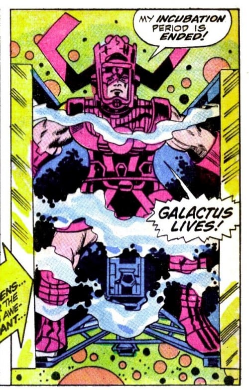
I’ve done an experiment: I colored the “Galactus Lives!” image, so I could comment on how the colorist’s choices affect the impact of this single image. My goal in coloring this image was to emphasize the energy being released from the cube; as I mentioned in the previous post, Vince Colletta’s inking obscured Kirby’s penciled energy with black.
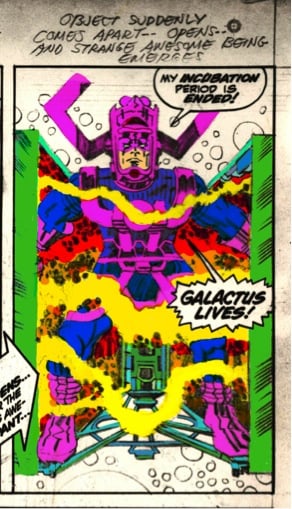
Let’s start with the whole page:
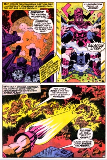
I don’t have an actual copy of the published book; my scans were collected in the 2000s from filesharing networks and fellow Kirby fans who exchanged scans. So I don’t know if the published image looks sort of green like the one above, or if that is an error in the scan. I tweaked the saturation a bit, and I suspect this is probably what the colorist intended — much more in the yellow range.
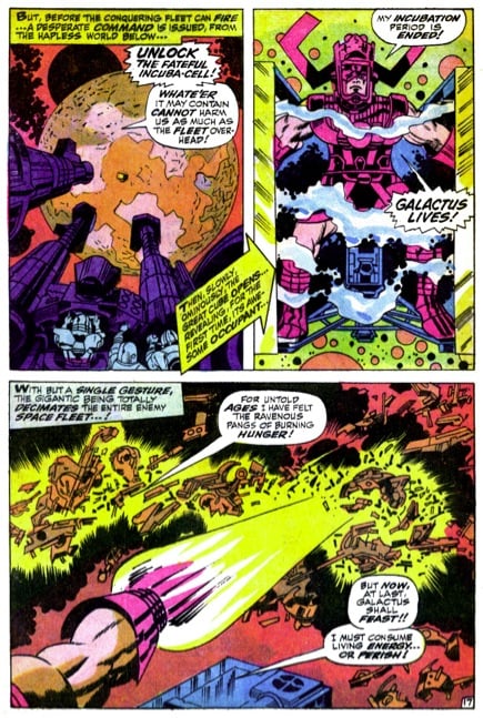
Notes on Panel One: Coloring those guns at the bottom dark purple obscures Jack’s machinery, and coloring the aliens in all-blue seems lazy; a little variety might have made that part of the illustration look more three-dimensional. The red background is also an odd choice: Red jumps out at the eye, so why make the background — which is not the focal point of the image — that color?
Notes on Panel Three: Yellow and red work to symbolize fire and energy, but the debris of the alien spacecrafts are all the same orangish-brown color. Was the colorist in a hurry? Some variety in the coloring of that debris might have made that image much more believable and dramatic. Instead, it’s very flat — except for Galactus’s arm, which has some shading.
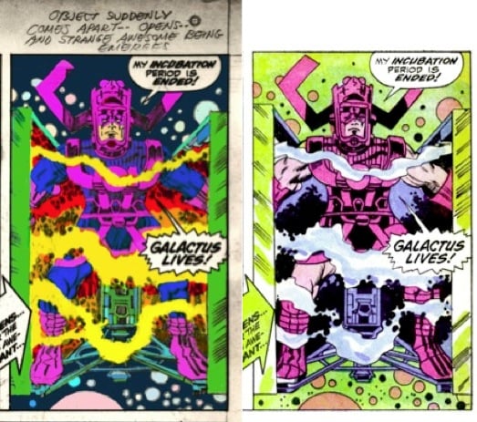
Using Kirby’s pencils as my starting place, I colored Panel Two. (Although I thought about inking the image first, because I knew coloring the pencils would look sloppy, I figured I’d experiment with Kirby’s original work.)
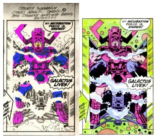
In the published version, the colorist has followed Vince Colletta’s cue and made Galactus’s arms and legs flesh-tone; the rest of the costume is purple. Which makes the Big G look like he’s emerging from a steamroom wearing an old-fashioned swimsuit. Also: the colorist has filled in Galactus’s eyes with purple. He’s also added color to Galactus’s right cheek, which makes it look like he’s turning slightly to his left — instead of right at you. All of these decisions — no doubt made in haste, or accidentally — lessen the power of Kirby’s work. It’s impossible to know what Kirby intended — but, as I’ve demonstrated throughout this series, as Kirby’s art changed hands, aspects of his unique energy got lost in the process.
In this next image, you’ll see that I’ve colored Kirby’s crackle and the cube:
I colored the cube green — because it works for contrast, and because green symbolizes life.
Finally, let’s think about the panel’s background color. The published version, in which Galactus floats around in what looks like pea soup surrounded by orange skittles, is fun — as an example of ’60s comics pop art. However, I think these colors deaden the potential impact of Kirby’s original composition. So I made a conservative color choice: a dark background, with low saturation colors for the planets so they recede into the void. Here’s the final result:
OK, my version is far from perfect. And the original is, like I said, a fun example of ’60s comics pop art. If a really solid inker lightboxed Kirby’s pencils and added some watercolors, the image could be spectacular though: Perhaps a movie poster for Fantastic Four 4: Galactus Lives! The point of the exercise is this: The colorist’s decisions are yet another filter that can and many times do obscure or dilute Kirby’s original vision.
ALSO by Rob Steibel: BTOOM! Kirby vs. Lee
KIRB YOUR ENTHUSIASM POSTS: Jack Kirby as HiLo Hero by David Smay | Douglas Rushkoff on THE ETERNALS | John Hilgart on BLACK MAGIC | Gary Panter on DEMON | Dan Nadel on OMAC | Deb Chachra on CAPTAIN AMERICA | Mark Frauenfelder on KAMANDI | Jason Grote on MACHINE MAN | Ben Greenman on SANDMAN | Annie Nocenti on THE X-MEN | Greg Rowland on THE FANTASTIC FOUR | Joshua Glenn on TALES TO ASTONISH | Lynn Peril on YOUNG LOVE | Jim Shepard on STRANGE TALES | David Smay on MISTER MIRACLE | Joe Alterio on BLACK PANTHER | Sean Howe on THOR | Mark Newgarden on JIMMY OLSEN | Dean Haspiel on DEVIL DINOSAUR | Matthew Specktor on THE AVENGERS | Terese Svoboda on TALES OF SUSPENSE | Matthew Wells on THE NEW GODS | Toni Schlesinger on REAL CLUE | Josh Kramer on THE FOREVER PEOPLE | Glen David Gold on JOURNEY INTO MYSTERY | Douglas Wolk on 2001: A SPACE ODYSSEY | MORE EXEGETICAL COMMENTARIES: Joshua Glenn on Kirby’s Radium Age Sci-Fi Influences | Chris Lanier on Kirby vs. Kubrick | Scott Edelman recalls when the FF walked among us | Adam McGovern is haunted by a panel from THE NEW GODS | Matt Seneca studies the sensuality of Kirby’s women | Btoom! Rob Steibel settles the Jack Kirby vs. Stan Lee question | Galactus Lives! Rob Steibel analyzes a single Kirby panel in six posts | Danny Fingeroth figgers out The Thing | Adam McGovern on four decades (so far) of Kirby’s “Fourth World” mythos | Jack Kirby: Anti-Fascist Pipe Smoker | Adam McGovern on four decades (so far) of Kirby’s “Fourth World” mythos | Jack Kirby: Anti-Fascist Pipe Smoker