BP Logo Redesign
By:
June 15, 2010
Editor’s note: This is one of the most popular posts, traffic-wise, ever published on HiLobrow. Click here to see a list of the Top 25 Most Popular posts (as of October 2012); and click here for an archive of all of HILOBROW’s most popular posts.
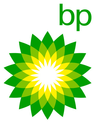
In 2001, British Petroleum shortened its name to BP and adopted the tagline “Beyond Petroleum.” Its new logo — which rendered the letters BP in cuddly, friendly lower-case type; and which included a yellow and green sun, spoke to the company’s commitment to the environment. (BP owns a solar energy company.) BP’s ad agency, Ogilvy & Mather, claimed the new logo and tagline allowed the company “to reinvent itself as an energy company people can have faith in and inspire a campaign that gives voice to people’s concerns, while providing evidence of BP’s commitment, if not all the answers.”
Greenpeace isn’t buying any of it. After the April 2010 explosion of the Deepwater Horizon and subsequent oil spill disaster in the Gulf of Mexico, they invited all comers to rebrand BP with “a more representative logo.”
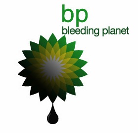
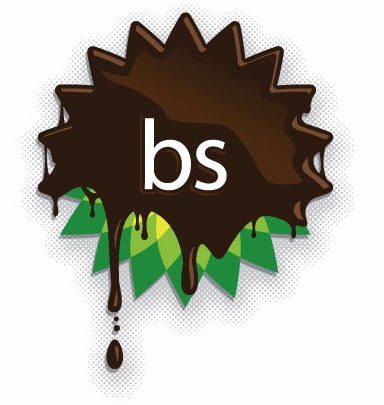
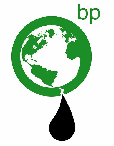
The logos above were selected out of the 1100+ entries uploaded to Greenpeace’s Flickr photoset.
ALSO SEE: Rushkoff vs. the 1% (1) | Tactical Utopia | Feral Dissent | Don’t Mourn, Organize | Occupying Our Gardens | Grand Theft Politics | The Black Iron Prison | News about the Wage Slave’s Glossary
